The evolution of attention
It’s not about designing alerts, but redesigning attention, resulting in 8 features capitalised by Duolingo.
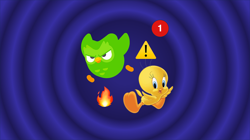
“I Taut I Taw A Puddy-Tat”
That catchphrase felt familiar to a generation of kids who watched Looney Tunes back in the 1950s. The immediate character that comes to mind is a small yellow bird known as Tweety.
In the cartoon, a standard formula would apply:
- Sylvester, the cat, wants to catch and eat Tweety, but some major obstacles stand in his way.
- Tweety says his signature lines, “I tawt I taw a puddy tat!” and “I did! I did taw a puddy tat!”
- Sylvester spends the entire film using progressively more elaborate schemes or devices to catch Tweety, but fails in the end.
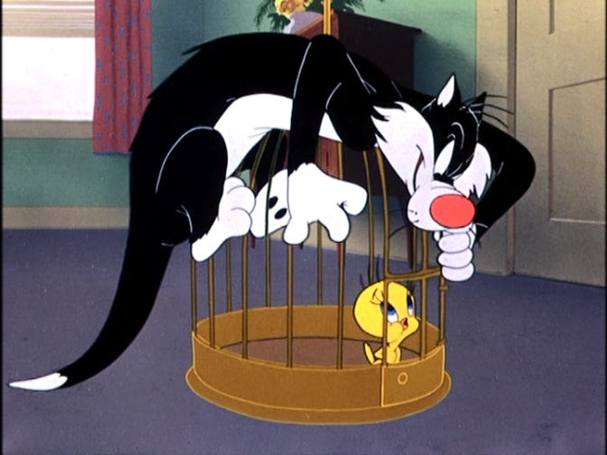
Interestingly, what meant to be slapstick humour showed a powerful mechanism of getting the attention of the audience through a predictable signal. In this case, a catchphrase leads to the reward of a series of silly actions.
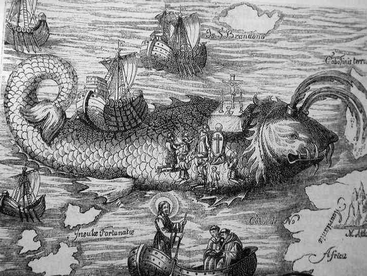
Whether it was coincidental or not, the archetype of the yellow canary seems to draw strong human interest. As early as the 15th century, Spanish sailors discovered these birds on the Canary Islands. Monks subsequently turned the canary trade into a monopoly business for their singing before the Italian traders managed to break the code and extensively breed canaries for their colour.
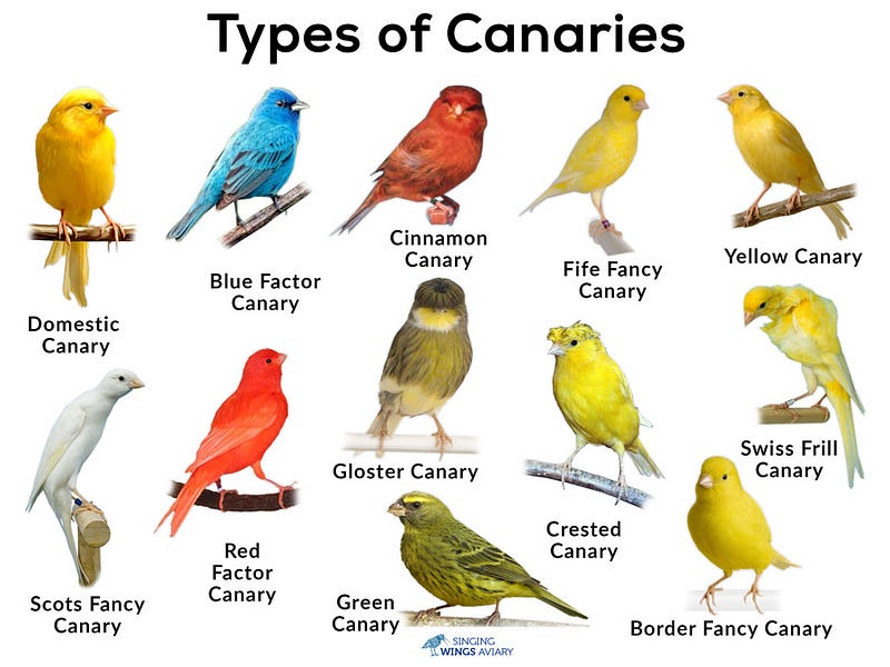
Originally, wild canaries came in three shades of colour: yellow, green, and black. Over the next 200 years, through various cross-breeding attempts with finches, similar to the dogs, the pure yellow Canary came to existence due to a good genetic mix of yellow lipochrome and colourant added to their diets. (At this point, it is worth noting that canaries also came in other colours, such as red, blue, white and green, but yellow is the most commonly associated colour.)
However, in a strange twist of events, from the mid-19th century until the mid-20th century, canaries started appearing in coal mines as an indicator of air quality. With higher metabolism, canaries were more susceptible to carbon monoxide, which was a silent killer and the cause of many mining fatality. So, as an early warning indicator, whenever the poor canary dropped dead, miners would know that there were dangerous levels of carbon monoxide, causing a quick evacuation.
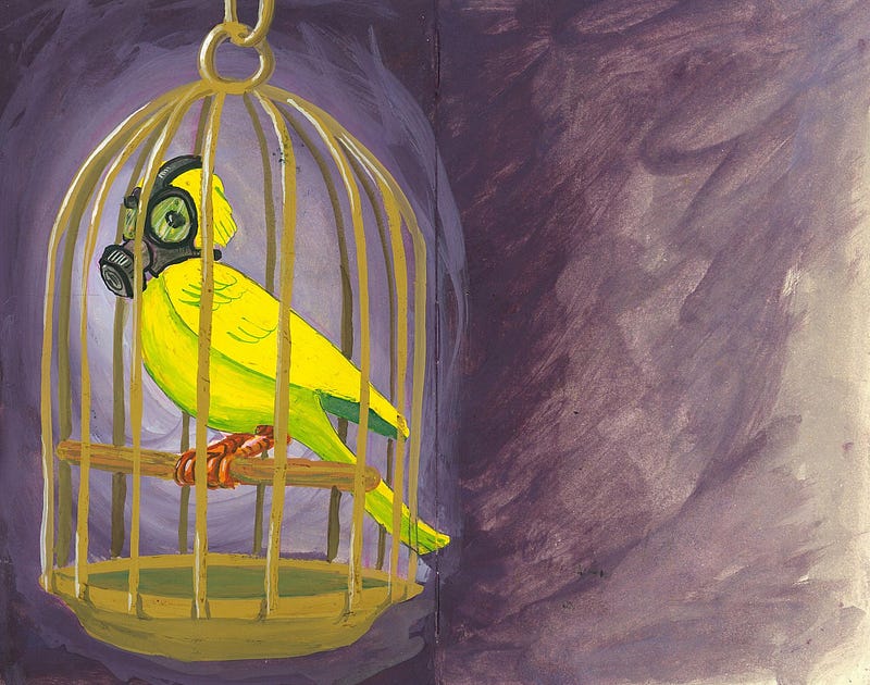
While canaries are now phased out of mining activities with carbon monoxide detectors, certain practices continued on, and we continue to see coincidental use of many canary elements, which signifies immediate attention.
One telltale sign is the use of yellow in road signs as the new standards in European road sign system being developed between 1926 and 1949. Yes, the yellow in snakes and bees signifies danger, or yellow could be more visible at night, but yellow canaries only further affirm the use of yellow as a universal colour for warning.
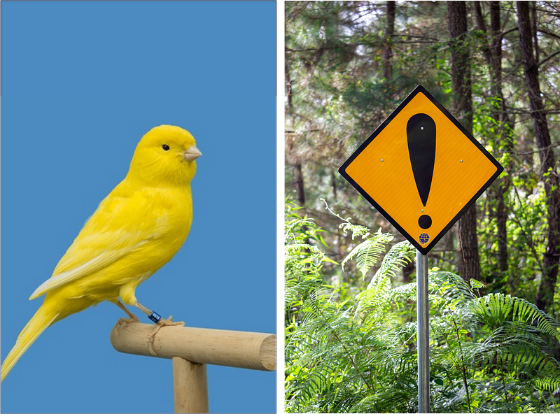
In fact, the saying “canary in the mine” now refers to a common definition of an early indicator of potential danger or failure, and the earlier and quicker we can anticipate danger, the better it is for everyone to respond to threats.
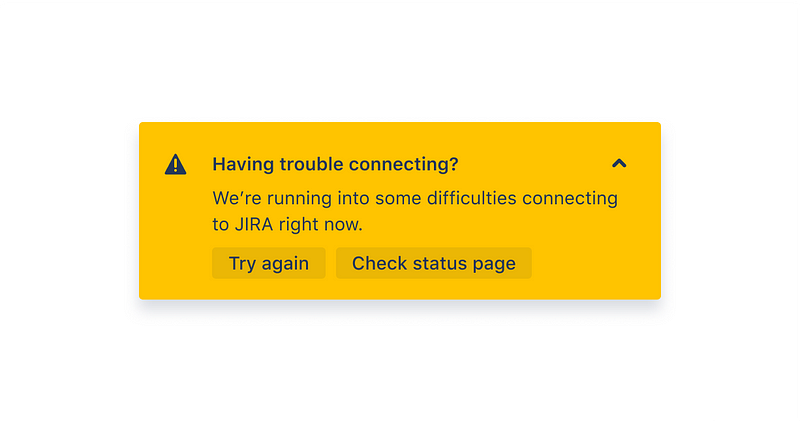
Today’s warning indicators, especially in the digital world, come in all shapes and sizes. Skeumorphic icons of warning signs ⚠️ are used along with callouts, banners, pop-outs, toasts and notifications. They are our modern equivalent of our yellow canaries, warning us when Sylvester or danger is sneaking up on us. We hate them when we see them appear, but we love them for preventing further collateral damage.
So far, design has warranted attention only when necessary to maintain order. It wasn’t until a little red dot started appearing on screens, that evolved our definition of attention. Two Apple Engineers, Chris Marcellino and Justin Santamaria, were granted a patent for their inventions relating to managing notification service connections on mobile devices as a display of icon badges. And where it really took off was at the iPhone debut in 2007, when Steve Jobs showed the interface for the very first time.
Since then, badge use accelerated after the developers got their hands on that functionality. It started with windows desktop computers as little blue badges at the lower right corner. Then, with social media as little speech bubbles or as rectangles. Before long, we saw three-digit figures, elongating that initial symmetrical circle.
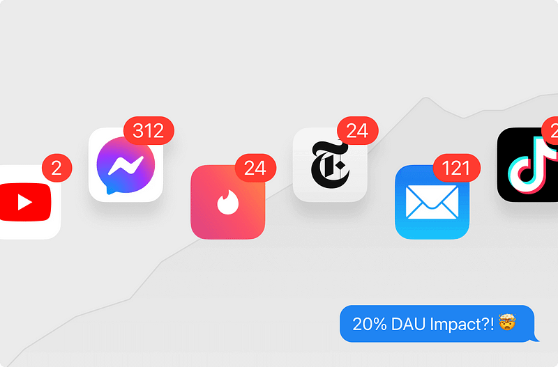
If we were to compare the notification badge to the canary, we see a similar pattern in how the captivation of the yellow canary was originally used as a form of entertainment or as a novelty breed due to its colour, but is now seen as a ubiquitous household pet.
Likewise, that little red dot offered a reminder about a new sale, a potential date from a matchmaking algorithm, or a new comment or follower from your social media feed. Today, it is part and parcel of our digital addiction.
However, we should also recognise that while notification badges are a way to gain attention, there are other mechanisms that will complement that experience. Consider the chime that accompanies the notification, or the complementary banners, alerts at the lock screens, toasts, further in-app notifications, and many more.
The same goes for our feathered friend, with its distinct chirping and other intelligent antics.
And so, if a company deliberately combines various attributes of the two attention grabbers together, you might get a sensational character like the Duolingo owl, also known as Duo. He is none other than our modern canary in the gold mine of education, where he does many tricks to get you to learn a new skill.
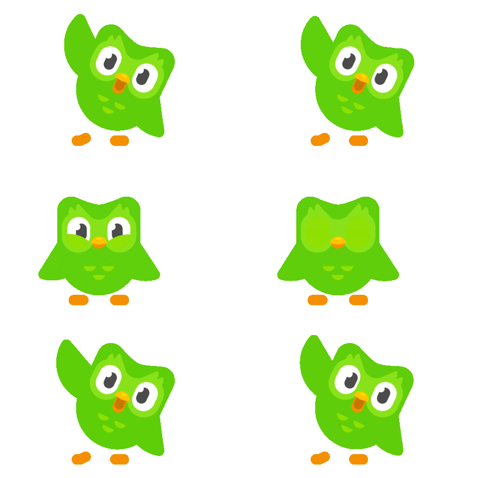
And why not have an educational muse? Isn’t standard UI ennui (a fancy way of saying something is mentally tiring)? Despite conventional wisdom of doing every digital interface by the rulebooks, Duolingo is challenging the norms with different yet sophisticated design wizardry, and it’s paying off.
Though not exhaustive, here are some of his best feats:
1. Not standard alerts, but crazily personalised push notification

2. Not typical transitions, but engaging animations

3. Not an app icon, but a face filled with surprises
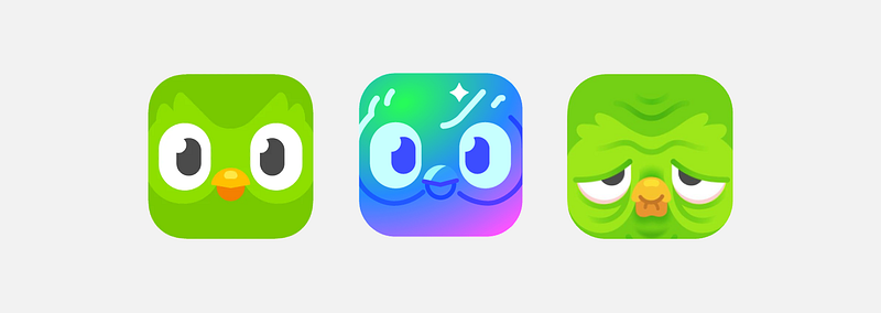
4. Not a utility widget, but an entertainer on steroids

5. Not a metric, but streaks on fire

6. Not a simple shape, but a cute brand ambassador
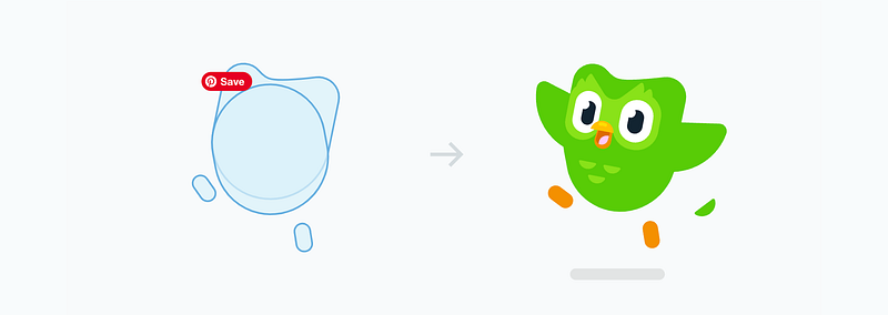
7. Not marketing, but byte sized storytelling
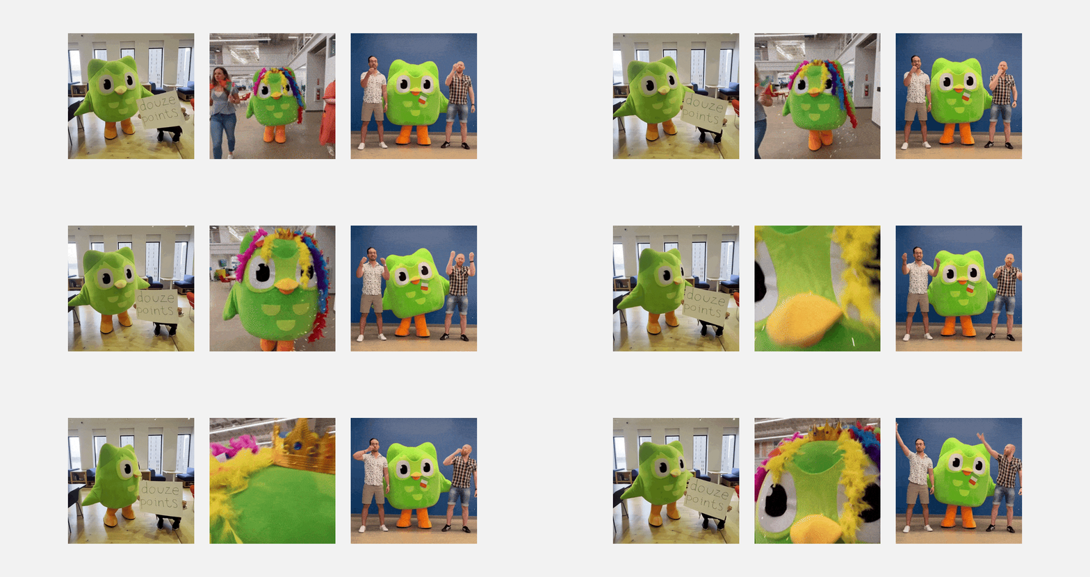
8. Not enn(ui), but butts
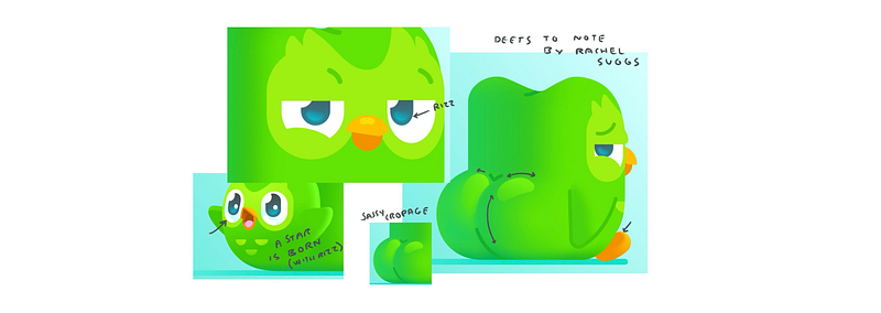
And what are the results from these various attention hacks?
Here is a snippet from the columnist at the Wall Street Journal:
The longest active Duolingo streak is now longer than 4,100 days. The only thing more impressive than a few people using the app every day for more than a decade is that five million people have streaks of a year. In fact, the company says that more than 70% of the product’s more than 30 million daily active users have weeklong streaks.
So where does this leave us as designers? Could there be a copycat competitor who take the formulas and reapplies them into their solutions? Would coming out with a character with two rounded bottoms win new users?
Most likely, no.
But from this story, one possible option remains, and that is to tap into the power of radical observations, especially in examples from the natural world.
Janine Benyus pioneered the term Biomimicry, which refers to a practice that studies nature’s best ideas and then imitates these designs and processes to solve human problems. Examples range from Velcro and burrs, to shark skin and swim suits, to ants and behavioural economics.
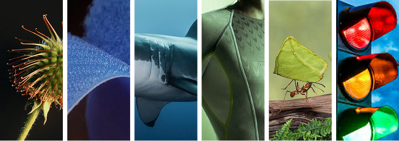
So when you look at Duolingo, one can possibly draw the link between the educational app and a real canary when it comes to attracting attention. We can see their relationship in many features, such as the use of vibrant colour, energetic movements, chirpy sounds, activities, varieties, and value. Above all, many biomimicry solutions like Duolingo are first movers in this space. They are truly innovative because they have learned from nature.
As designers, our observational skills set us apart from many other disciplines. Besides looking at direct competitors, it is our imagination to link two abstract concepts together that matters. As we think about our next big idea, perhaps visit the next nature reserve or local zoo for inspirations. You may come across a yellow canary or green owl.
References
99pi. (2020, September 15). Highways 101. 99% Invisible. https://99percentinvisible.org/episode/ubiquitous-icons-highways-101/transcript/
Benyus, J. M. (1997). Biomimicry : innovation inspired by nature. Morrow.
Bonney, A. (2020, September 8). The historic roots and modern connotations of “Canary in the Coal Mine.” The Gale Review. https://review.gale.com/2020/09/08/canaries-in-the-coal-mine/
Herrman, J. (2018, February 27). How Tiny Red Dots Took Over Your Life. The New York Times. https://www.nytimes.com/2018/02/27/magazine/red-dots-badge-phones-notification.html
HT School Web Desk. (2022, September 11). Canaries and the mysteries of colour: Here is what you didn’t probably know. HT School. https://htschool.hindustantimes.com/editorsdesk/knowledge-vine/canaries-and-the-mysteries-of-colour-here-is-what-you-didnt-probably-know
Omlet. (n.d.). History of Canary Keeping | Canary | Finches and Canaries | Guide. Www.omlet.co.uk. https://www.omlet.co.uk/guide/finches_and_canaries/canary/history/
Staff, D. (2021, September 15). The History of Warning Signs — Designbeep. Designbeep.com. https://designbeep.com/2021/09/15/the-history-of-warning-signs/

