What UX can learn from 2024 Olympics fashion
The 2024 Summer Olympics is finally over, but we can apply contextual design into our practices.
The 2024 Summer Olympics is finally over.
Over the course of 2 weeks, we saw many marvelous feats, such as the USA being the first country to reach the record of obtaining 3,000 Olympic medals, Noah Lyles being the fastest man in the world with 9.784 seconds, Leon Marchand’s extraordinary win of 4-times gold medals, and the theatrics from skateboarding and breakdancing by Japan’s champions.
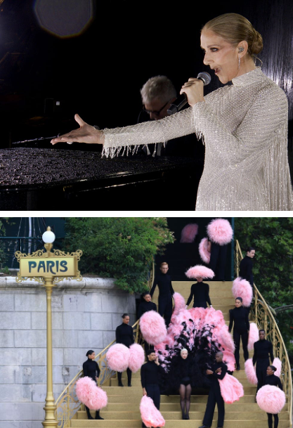
Even the opening and closing ceremonies were executed with finesse, albeit with some controversy over a skewed interpretation of the Lord’s Supper. But with a stellar performance by Celine Dion, Lady Gaga, and many other artists, as well as the dazzling fireworks and laser projections, one might conclude that the Paris Olympics 2024 is a resounding success.
The best of Paris — Fashion
Despite the tremendous effort and cost it takes to set up an Olympic, it wasn’t really hard not to be successful. After all, Paris is best known for many things: architecture, arts, food, music, and theatre, to name a few. It is seen as the pioneering city in the arts and sciences and is often referred to as the city of love, not just for romance but for individuals who are fuelling their passion in the pursuit of excellence. And one particular niche, particularly in Paris, is the art of exclusive fashion and high sewing, also known as Haute Couture.
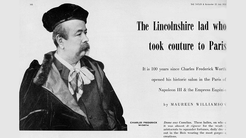
Dating back to 1858, when Charles Frederick Worth, an Englishman, founded the first genuine couture house in Paris, haute couture now holds strict criteria for any brand to retain the prestigious label. For example, designs must be made to order for private clients. They must present a collection of at least 25 original designs twice a year at Paris Couture Week. Think catwalks with fashion models in original designs, and you are not far off.
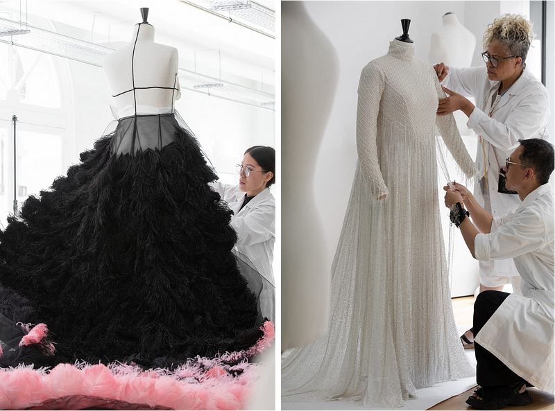
So it made good sense to appoint the French label Dior to prepare each respective costume for Celine Dion and Lady Gaga. However, although Paris continues to be the official fashion capital with 16 legal haute couture houses, there have been other contenders outside of France who attempt to be worthy challengers.
But there are other tailors
Just like the Olympics, we have seen many countries respond to this year’s opening ceremony of the marching in (or floating by the Seine) of athletes by hiring their top fashion houses to produce unique clothes for their teams.
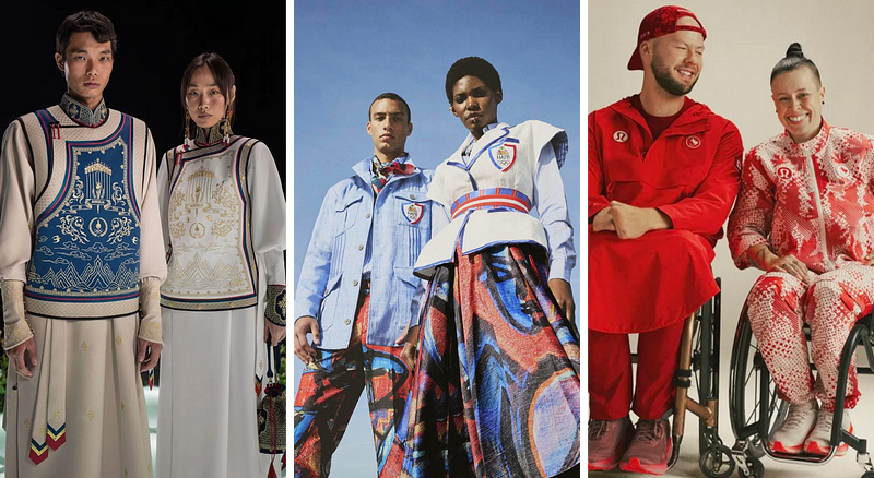
Among the countries that impressed were these podium winners:
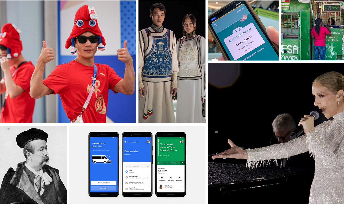
- Mongolia for fusing cultural heritage with modern craftsmanship
- Haiti for their collaboration with Haitian painter Philippe Dodard
- Canada’s home brand, Lululemon, takes on inclusivity by conducting product testing and feedback sessions with 19 Canadian Olympic and Paralympic athletes across 14 different sports to understand their unique needs during the Games.
And what about the flops? Behold, the top three losers:
- The United Kingdom’s reputable fashion house, Ben Sherman, was, according to one critic, plain-looking and overall “looked too casual, almost disrespectful to the occasion.”
- While the French men looked suave in their Beluti attire, their women athletes in sleeveless blazers looked like a bad comparison, with exposed arms and unfittingly masculine cuts.
- USA’s Ralph Lauren may have overdone the uniform with too much going on at the top and too rugged with light-washed denim jeans. As one newspaper columnist says, “Team USA is like posh prep school students who got lost on the way to a horse ranch.”
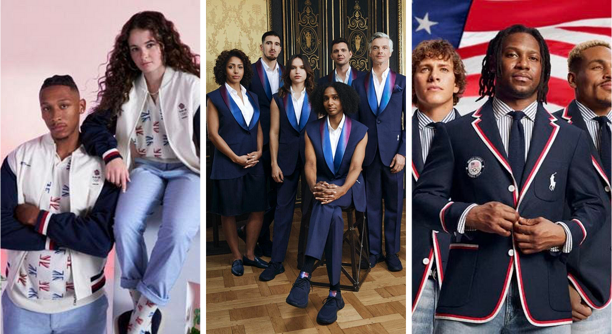
The contrast is plainly obvious. Critics and netizens slam designs that are either too dull (UK), outlandish (France), or preppy (US).
Yet, couldn’t we say that of our designs, particularly in UX/UI?
Let’s face it. We have been through situations where we either played safe with generic-looking components, produced designs based on what the clients want and not what the end users need, or dressed up a screen to make it look good, but it was actually something else on the inside. Beneath the frills isn’t the substance that ties the form to the function.
Contrary to inclusive design, this is a classic situation where design is completely out of context without the citizen (or consumer) in mind, resulting in mediocre content. The reverse is true when designers truly understand the situation based on good insights that inform how the design would lead to better outcomes, which is better known as contextual design.

About toilets
Consider a ubiquitous piece of sanitary hardware known as the toilet. Not only are there different typologies of sitting, squatting, and standing to cater for different situational and gender needs, but they also have cultural differences. High-tech toilets that warm the seat and have audio outputs are mainly found in Japan’s obsession with cleanliness but also in mechanical electronics. Some homes also integrate the wash basin directly above the toilet bowl due to the narrowest bathroom dimensions, or even a dedicated spout for fresh, clean water above urinals in public spaces as part of a religious ablution process.

If context informs the eventual utility of design, then having different digital experiences in different locations is important too.
About ridehailing
This was why Uber had to break out of its mould of having one universal interface. After visiting places like Southeast Asia, Latin America, and certain parts of the Middle East, design teams discovered that the needs of those citizens were radically different from those of New Yorkers.

By being on the field, the Uber team realised the nature of spotty internet connections, low-spec smartphones, and a barrage of other issues that made the Uber app unusable. They couldn’t bring US-quality denim jeans into these countries. Instead, they had to rip apart their app and take out their sacred cows. In this case, with the removal of the map interface, Uber Lite was born with a new design language to meet the specific needs of a large user group.
About money
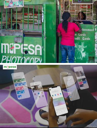
The same can be said about money. Unlike countries with well-supported banking infrastructure, citizens in rural areas and villages need a different payment method, especially because most do not have a bank account, let alone visit one. The digital solution is one that requires an agent outlet, a phone with a compatible SIM card, a valid identification document, and a 4-digit pin. Users can then make payments and transfer money to vendors and family members with SMS messages.
Today, a staggering 59% of Kenya’s GDP flows through M-Pesa, the dominant mobile payment system serving the unbanked population. It’s parent company, Safaricom, has 30 million customers using the service monthly in Kenya and 21 million other customers in 6 other African countries.
M-Pesa now bolsters a range of unique financial products, including their own super app and the teenage version, M-Pesa Go, to improve digital money management and financial literacy for teenagers. There doesn’t seem to be stopping M-Pesa as their international competitors struggle to make themselves relevant, especially because of the limited memory storage of their most precious apps on the consumer’s phone.
East vs. West, or everywhere at best?
Stories of interfaces like East vs. West can be sensational because of their extreme design opposites. One writer succinctly summarises the main difference between the two contexts:
Western design emphasises spaciousness and directness, while Asians value rich content and implicit communication. It’s fascinating to observe how distinct cultural communication norms shape their different design approaches.
The “less is more” imperative of the Western world clashes with the “more for less” Asian ideals. Thus, Asian interfaces tend to be denser and packed with symbolism and features, while Western interfaces look cleaner with straight-forward copy to ease cognitive load.
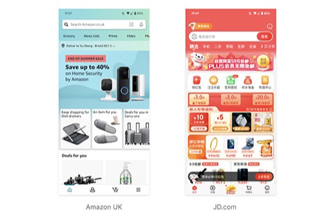
The problem with this thinking is that it is rather single-dimensional because it is targeted at two dominant nations, almost catering to the Olympics in a few countries, and forgetting the rest of the rich design diversity.
Thankfully, we are seeing the emergence of discussions of other cultures. One of UX’s founding members, Jakob Nielsen, recently interviewed two African designers about specific cultural differences. The topic ranged from the language difference, which amounts to 500 different languages spoken in one given region, to illiteracy and how image-first design with universal icons is the treatment used in rural areas. However, everyone agreed on the value of ground-up research by investing time to see the lifestyle and marketplaces of the actual users.
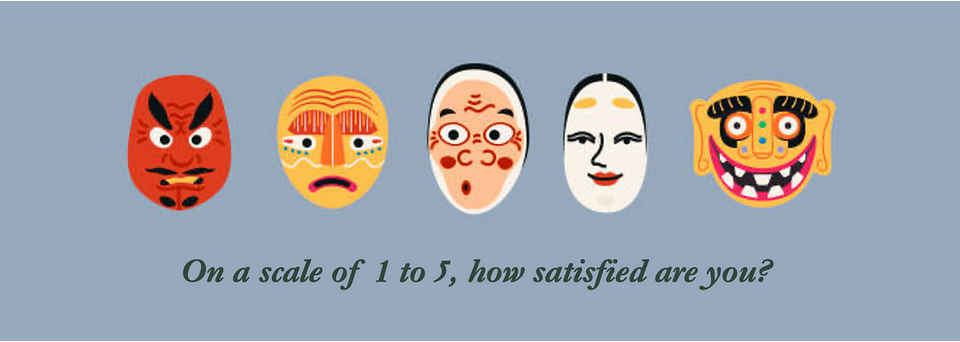
About cute mascots
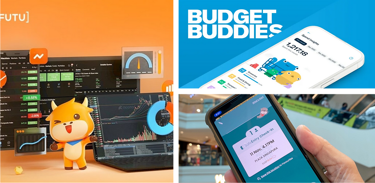
In one account, the African designer shared, to his surprise, how one cute animal icon was actually perceived to be rather unsettling in one local community. Such a statement would be rare in a place like Singapore, where various digital solutions seize the opportunity to capitalise on cute mascots. Examples range from the Trace Together OTTer used during the COVID pandemics to Budget Buddies used to track expenses from a local bank, right down to an orange cartoon cow, moomoo, that deals with global investments. The strange dichotomy of using cuteness over serious matters is a rather perplexing but culturally accepting behaviour among Singaporeans and Southeast Asians.
Which leads us back to the Olympics. When the Paris Olympic mascot was finally unveiled in 2023, its appearance dumbfounded many observers with its goofy, less elegant appearance. The French were rather unforgiving, with 54% of them not knowing what the mascot means in a national poll. This led to various degradatory names for it, such as the crumpled Eiffel Tower or the not-so-pleasant brown emoji figure.
Despite the cringy start, the mascot made a huge turnaround as the symbol slowly grew on spectators. It did what every mascot would do—lighten the mood with its absurd prancing, but the satirical yet sartorial souvenir was brilliant with its concept, especially when you see a multitude of people wearing the red hat on their heads all at once. And by wearing the Phryge on your head, you are effectively wearing the spirit of freedom.
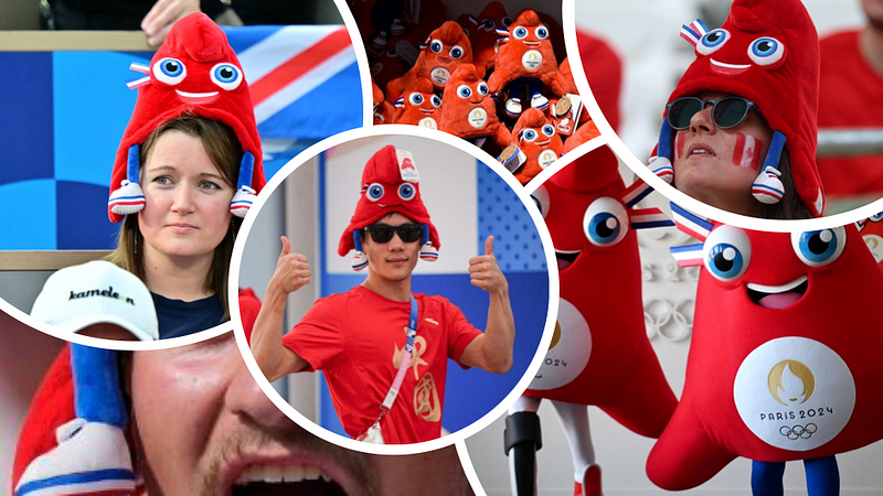
Once, its very own people despised the awkward design. Now, many citizens of different nations have chosen to embrace the uncool, and eventually got on to buy them for themselves and their loved ones, generating a projected sales of close to 2 billion euros. The phenomenon may actually fulfil the mascot’s very motto, “Alone, we go faster, but together, we go farther.”
It comes to show the power of unpredictable human nature that denim jeans and haute couture are not the only dominant fashion symbols, but stories literally embedded as thread into the gears of Olympians have a place in the hearts of people. Likewise, our digital designs do not need to carry the same patterns. They can emerge as icons, 4-digit pins, or cute mascots. And if many people now love what was initially seen as ridiculous, perhaps there is value in accepting what the other side has to offer.
With US and Australia lining up as the next Olympic venues till 2032, the world might need to wait a little longer before we get a chance to see who’s next. Glancing over the entire list of past Olympic games, it appears that Africa is the last continent that has yet to host an Olympic game. I’m hopeful to see it within my lifetime, and if so, I’m raring for a new wave of afrofuturistic designs and more.
References
Chang, J. (2023, December 18). Innovating or Imitating? The Interplay of Western and Asian Digital Product Design :: UXmatters. Www.uxmatters.com. https://www.uxmatters.com/mt/archives/2023/12/innovating-or-imitating-the-interplay-of-western-and-asian-digital-product-design.php
FRANCE.FR. (2023, August 2). Everything You Need To Know About Haute-Couture. FRANCE.FR; FRANCE.FR. https://www.france.fr/en/article/everything-you-need-to-know-about-haute-couture/
Karmali, S. (2024, July 27). Inside the atelier: the making of Celine Dion and Lady Gaga’s Olympic Opening Ceremony looks. Harper’s BAZAAR; Harper’s BAZAAR. https://www.harpersbazaar.com/uk/fashion/fashion-news/a61715593/celine-dion-lady-gaga-olympics-opening-ceremony-costumes/
Nielsen, J. (2023, October 25). UX in Africa. Substack.com; Jakob Nielsen on UX. https://jakobnielsenphd.substack.com/p/ux-africa
Press, A. (2024, July 24). From inclusivity to traditional: Here’s a preview of Paris Olympic uniforms for different countries. Fast Company. https://www.fastcompany.com/91162109/paris-olympics-fashion-uniforms-countries?partner=rss&
Schwab, K. (2019, July 15). How Uber quietly redesigned its interface for the rest of the world. Fast Company. https://www.fastcompany.com/90375845/how-uber-quietly-redesigned-its-interface-for-the-rest-of-the-world
Stadler, C. (2024, June 11). M-PESA: Why The World’s First Large Mobile Payment Platform Keeps On Winning. Forbes. https://www.forbes.com/sites/christianstadler/2024/06/11/m-pesa-why-the-worlds-first-large-mobile-payment-platform-keeps-on-winning/
Twardzik, E. (2024, July 29). All the Uniforms Worth Ranking From the 2024 Opening Ceremony. Robb Report; Robb Report. https://robbreport.com/style/fashion/experts-rank-paris-olympic-uniforms-1235701099/