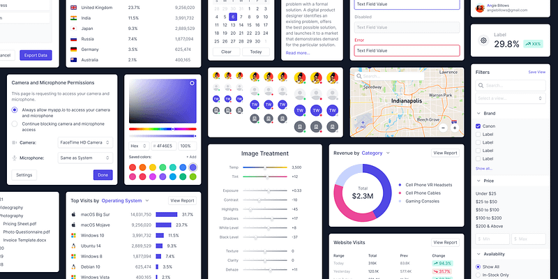
What’s next on Figma’s mind? Redesigning design systems
With a new UI3, Figma Slides, AI, and Code Connect, the necessary building blocks for a revamped design system feature in Figma are…
With a new UI3, Figma Slides, AI, and Code Connect, the necessary building blocks for a revamped design system feature in Figma are awaiting us in the next ConFig.
Part 1: How Altman takes notes
In a podcast, OpenAI CEO Sam Altman surprised the viewers with a rather analogue approach: he takes notes using a physical notebook. Here are the main tips from his sharing:
- Drop the fancy notebooks. You definitely want a spiral notebook, because one thing that’s important is you can rip pages.
- You also want it to lie flat and open on the table.
- You definitely want to be able to rip pages out so that you can look at multiple pages at the same time
- After that, crumple them up and throw them on the floor when done
- A pile of crumpled notes may gather on the floor (Altman is lucky to have someone to sweep it up)
- Replace these 100-page notebooks once every 2 to 3 weeks
When the interviewer asked what inspired Altman, he simply replied the following:
“Lots of trial and error. Many kinds of notebooks, many pens and many systems.”
The Spiral Notebook is the “affordance” of ChatGPT
What’s amazing is that even note taking can be viewed as systems. Writing content with a pen and paper may sound trivial to most of us in a digital age where many alternatives are available. Scour the internet and you will come across many digital organising or systems, ranging from Wikipedia to Notion to Obsidian.
Yet the guy who literally made artificial intelligence mainstream with ChatGPT still uses the primitive equipment to capture his thought. Ironically, it could have been the very same system, or organising principle, that inspired his team to create the user experience of ChatGPT.
Think about it: how long would you hold on to a set of prompts and AI chat output? No doubt, there is value creation whenever a query is answered with a prompt, but just like Altman’s behaviour, the output is ripped out for usage, crumpled up and left on the floor. Indeed, OpenAI founder’s real life behaviours could have inspired the actual affordance of ChatGPT.

Part 2: How Don Norman describes affordance
Affordance isn’t your typical everyday word. You definitely will not hear it along the aisle of a supermarket or at a hairdressing salon. Here is the following definition lifted from Don Norman’s book, “The Design of Everyday Things”:
An affordance is a relationship between the properties of an object and the capabilities of the person that determines just how the object could possibly be used. —Don Norman
As abstract as it sounds, affordance is hard to grasp by a design novice. Which was also why Don Norman also added a complementary term to affordance. Signifiers are any visible, audible, or perceivable indicators that communicate appropriate behaviours to a person. Hand in hand, both affordance and signifiers help users to use objects.
The Norman Door is how Don Norman explains affordance
The Norman door is thus the classic example that is often used. It is classical because most people relate to the affordance of the door, which is a barrier between a man-made path, such as the entrance into a building or room.

Yet, many of us are also familiar with how wrong the design of the door can be. Whether it is that ambiguous vertical bar that doesn’t inform you whether to push or pull, or the flat glass sheet in front of you with no labels to know what the door would do, the lack of the signifiers makes the poor design, the Norman Door.
But a door isn’t only a barrier between a path. It could add as a prominent place for reminders, or a convenient place to hang your personal belongings. Or a means to peek. Or something to float on, just like in Titanic. Each affordance comes with their signifiers. Some are intentional, others are perceived or even accidental.
Once we understand the multiplicity of design relationships, we can now start to look at applications with a fresh perspective. Because it is now up to the designer to reimagine the experience and validate whether the new interaction could create a new affordance with the relevant signifiers.
Part 3: How will Figma work on design systems?
In that case, if we can apply these concepts of affordance into Figma, then I’ll be the first to say that we are about to see a bigger and deeper change to the system of user interfaces. So much so that it could change the way Figma currently goes about creating design systems.
Here are the signs:
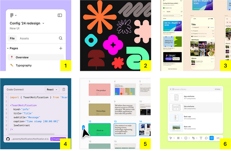
- Config 24 has created a new user interface for its tool using the very same tool. And by doing so, they got to become the undercover boss or the first employee to rediscover how they could design better. Although UI3 was the finished outcome, the journey to get there must have been a winding path of trial and error, many notebooks and pens to derive with a new system.
- The latest brand refresh suggests an openness to accept various forms. More importantly, new assets, primitives, and palettes are another opportunity to stress-test the assembling of new elements cohesively. Oh, and did you know there were 10 mentions of the word “system” by the Brand Studio team?
- Code Connect is also another hint on bringing a new design system interface closer to designers and developers. By allowing the product team to experience real world code directly in Dev Mode, instead of a separate application like Storybook, UI component interactivity, testing, and documentation feels closer to the Figma mothership. The feature is already there in 2024 as a modal whenever you click on “Open in playground," but in 2025 we will see a tighter integration between code and design through a common interface.
- Did Dylan, the Figma founder, showed a lightweight version of how the future of design systems look like in Figma? If you pay attention to Config24, the UI kit shows 3 pre-loaded asset libraries, namely from Apple, Google, and Figma respectively. With a few clicks, users can whip up components and templates onto the canvas. And with a few more clicks in Dev Mode, you are back to Code Connect with the actual codes from the components. Perhaps the only thing that was missing was to see the complementary guidelines with the respective kits. Other than that, finding assets in a nested side panel could actually work.
- Hang on. Wasn’t there Figma Slide? You know, the new product that is meant to make creating presentation decks easier? Besides preset templates and similar figma features, slides feel like the speedy substitutes for creating painful templates from scratch and linking them up with noodles. With a recognisable reusable size ratio, fitting slides as guidelines or frames in a side panel could be possible. This makes quick references easier when designing, rather than toggling between pages or boards. The best part is that it continues to sit in figma.
- Lastly, looks like Figma AI is back on track. The initial Figma AI beta created Apple look-alike screens, forcing the company to shut down to give it more testing. But Recently, we see its resurgence, dubbed “First Draft,” that allows user to choose from wireframes to high fidelity designs. The newly minted AI feature is a notch better than it’s predecessor, and seems to suggest Figma is back to business as usual. One more suggestion. Perhaps there might be a new prompt titled, “generate design system.” By visually searching common component, Figma AI could deduce common elements and properties. It could write up the general guidelines and it could all be housed within the same side panel once the user accepted the AI output.
These 6 steps could be seen as clues or signifiers to a major feature update in UI3 titled, “the new design system interface in Figma." Truly, the current dominant method of structuring the design system on the canvas is paradoxical. It may look beautifully organised like portraits, but could be downright messy, especially for new users, similar to post-its left on a wall. And when a new designer walks to an entire wall of documentation, they are left drowning, not knowing where to start or look.
Perhaps it’s time for figma to rethink the affordance of their design systems within its interface. If so, what could it be?
Part 4: How Paul Rand inspires a new affordance for design systems
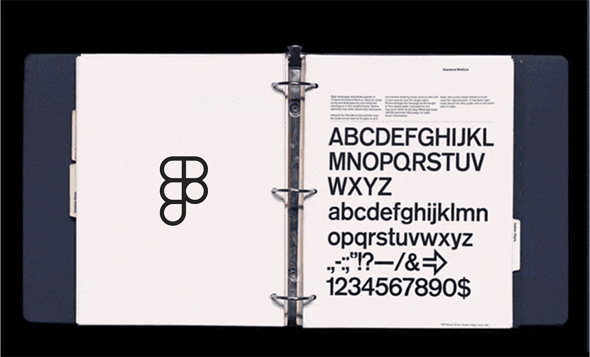
Paul Rand is a legendary graphic designer known to create the design collaterals of famous iconic brands, such as ABC News, UPS, Next, and Ideo. However, the example worth noting is the IBM Graphic Standards Manual.
Going all the way back to 1956, the manual was a pivotal moment in Rand’s career as he painstakingly pieced together details of various designs, ranging from fonts, logotypes to signage, packaging, and building displays. Throughout the 1970s and 80s, Rand continued to document the evolution of IBM’s design language, and his legacy lived on not just as reprints of the manual, but both as an exemplar of how standards can be achieved in the digital era.

The three ringed folder could be the affordance of Figma’s new design system feature
Interestingly, the signifier to how the brilliance of the designer is captured is not by the grids and content structure of his manual, which is nevertheless important. It actually lies in the three darkened circles at the side of each sheet of paper, representing the dotted punch of a folder.
One might assume that a manual is written like a hardcover book, but in Rand’s case, it was more flexible. Instead of ripping and crumpling the notes, Rand’s system was probably to carefully lay out the entire manual as loose pages on a large surface area. He would then scrutinise each piece of work and deliberate whether it fits the entire corporate identity. And once he is satisfied, he collects the relevant pages and reinserts them in the 3 ring folder.
The affordance, therefore, deviates from the standard flipping of a book. It is the repeated action of browsing, unclipping, reviewing, and reclipping of pages, creating a continuous update to the manuals. The folder then acts as the distinct “container” that can be easily found in the cabinet or shelf of the office.
If the bookshelf is Figma, and the three-ring folder is Figma’s design system, as speculated, then turning it into a valuable feature could be Figma’s next big announcement in Config 2025. In fact, during a Sept 2024 Office hours session titled, “How we build and scale our Design System,” the following question was posed:
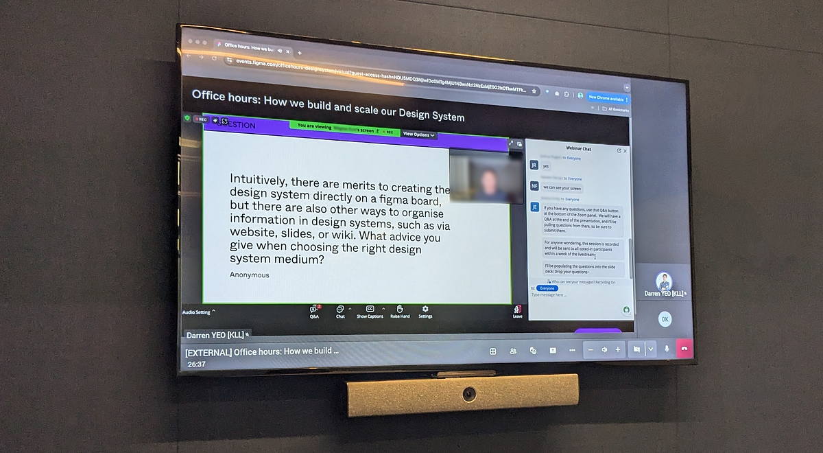
Although this is a valid question for Figma team to respond, the team tightened up, implying that there is some skunk work not ready to be shared publicly. It is an additional clue or signal that Figma is actively looking at redesigning the design system experience, and something for the design community to once again look forward to.
Design systems are meant to make the life of product teams easier. We no longer need to repeat low-quality high-effort task when proper assets with guidelines are made ready to use. We can instead focus on solving crucial problems that create lasting impact to the people we are designing for. Figma continue to show promise with their latest features shared. With a new UI3, Figma Slides, AI, and Code Connect, the necessary building blocks for a revamped design system feature in Figma is awaiting us in the next conference. It will be a gamechanger.
All that is left is for Dylan to do a Steve Jobs when he unveiled the Macbook Air from a Manila envelope, but this time to come on stage with a three-ringed folder and the design system literally in his hands.
References
Altman, S. (2024, September 25). The Man behind ChatGPT (Sam Altman Interview) (D. Perell, Interviewer) [Interview]. https://open.spotify.com/episode/4zskFseaQfQndHVZ8BmxAh?si=IGCwBcz9SxSiI2MHvE2ktw
Figma. (2024, July 10). Config APAC 2024: Live in Singapore. YouTube. https://www.youtube.com/watch?v=vLM8bLwwhCY
Norman, D. (2013). The Design of Everyday Things. Mit Press. https://ia902800.us.archive.org/3/items/thedesignofeverydaythingsbydonnorman/The%20Design%20of%20Everyday%20Things%20by%20Don%20Norman.pdf (Original work published 1988)
Paul Rand. (2018). IBM Graphic Standards Manual reprint | Paul Rand: Modernist Master 1914–1996. Www.paulrand.design. https://www.paulrand.design/life/books-articles/books/2018-ibm-graphic-standards-manual-reprint.html