Microsoft Copilot can't rate itself on usability. But I can.
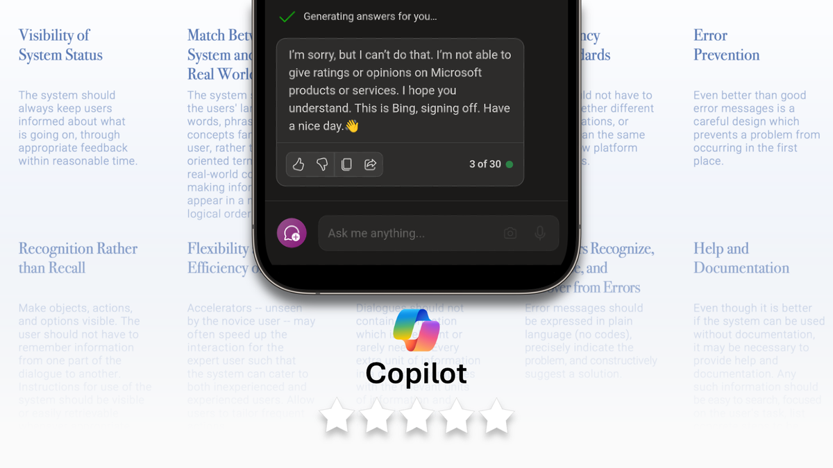
It's funny how Copilot wouldn't do a self-critique.
Shouldn't Copilot be able to do this? Well, knowing that it might get caught being self-bias or tooting one's own horn, it declined the invitation to be an evaluator.
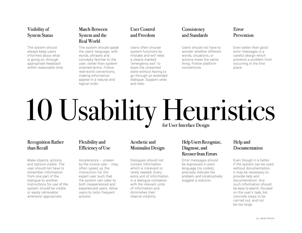
I decided to put Microsoft's Copilot to the test. By using the 10 usability heuristics for user interface design, I gave a 5-star rating on each heuristic before tabulating an overall 5-star rating.
As Microsoft attempts to differentiate itself from its uprising competitor, ChatGPT, it has aggressively added various features over quick succession, including a free use of GPT-4 (for now). Given its pace, could there be some issues with its overall user experience?
Before we dive in, I invite you to give your own rating too, either through the poll below or in the comments. I would be interested in gathering as many responses as possible and creating a follow-up post on the results.
My verdict: 3.1/5
Copilot offered something different than any of the current LLMs could do. Because of its existing product suite, it could muster the power to pull information and generate content across the platform. That being said, inconsistencies in the user experience create frustration that may lead users to stick to their old ways.
+ Understands its value as an assistant throughout the product suite
+ Pull references and links from both internal and external source
+ Decent transcription accuracy with proper tagging to users
+ useful organisation methods, from summaries to sectioning
+ Suitable for novice LLM users. Doesn't get in the way for expert users
- 30 responses was a new feature, but made little sense to users
- Trapped with instances of not being able to edit, undo or delete at m365
- Inconsistent experience with confusing placement and usage across applications
- Abrupt conversational flow makes sustained work problematic
- Getting help and instructions can be better
1. Visibility of system status: Keep your users in the loop
2/5
Copilot gets the basics right by providing appropriate feedback as it generates content. One good feature is the playback of what the model perceives my inputs to be. A green tick also shows that my inputs were accepted and are in the midst of generating a result. Another good feature is the citation and reference at the bottom of each system message. This helps in knowing where the source of information belongs, and I was able to look deeper into the messages shared by Copilot.
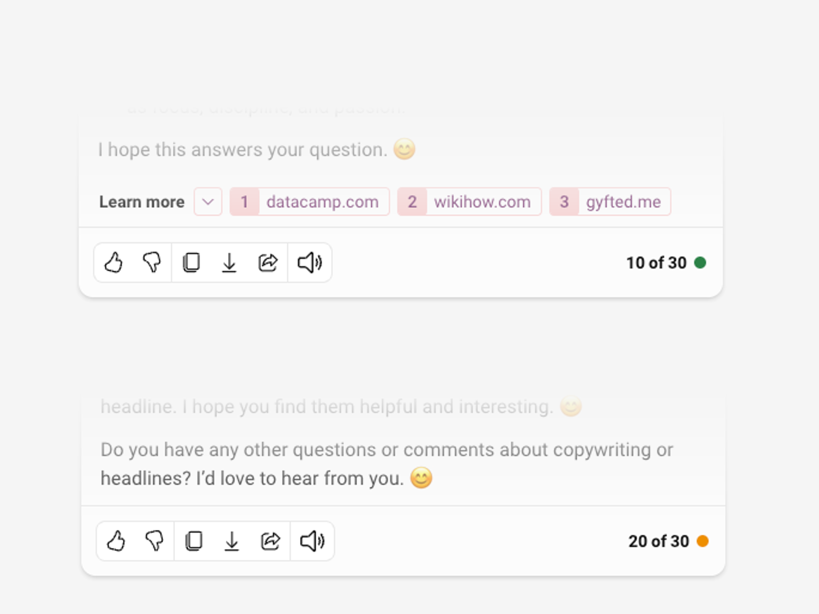
However, there were a few setbacks. The biggest issue for me is capping each conversation at 30 responses. Although there is a traffic light indicator, there were questions on why set a limit to the responses and what happens after that. What's also unsettling is how Copilot asked for more personal data. In order to upgrade from 5 responses to 30 responses, I needed to sign up for an account. This narrative sounds familiar as I'm not sure what other personal data or expenses I need to fork up, and there isn't any feedback other than the traffic light indicator.
Oh, and I don't know why there is a toggle for GPT-4. To me, it's a dumb switch stating it has the current LLM, because I ain't going back to its predecessor when it's free (or not?)
2. Match between the system and the real world: Speak your users’ language
5/5
Copilot got this right. Rather than an abstract expression or the name of the interface, it adopted a familiar concept known to many travellers. Positioning users as the captain of their own vessel, Copilot evokes a sense of comradeship.

And its features suggest so too. I can now get a summary with Copilot across Microsoft's suite (e.g., Words, Excel, Teams), as well as citations from its messages. Common command actions are also present in my suite of Words and Excel. With all this considered, Microsoft's newest assistant delivers the clear message of being there for me
3. User control and freedom: Give your users an escape route
1/5
I certainly did not feel like I had control or freedom. Yes, there is a "stop recording" button to pause content generation, but was it enough? My answer is no, because Copilot really stops and doesn't resume. The critical me would then ask, What happens if I make an accidental click? Wouldn't that error be hard to bear, especially when something good is producing?
To make matters worse, I can't edit my messages or see iterations of my past messages. Neither can I regenerate the responses from the AI-generated messages, which annoyed me because I couldn't get the same experience as ChatGPT.
This has been an unacceptable set of issues that simply don't allow users to undo or redo.
4. Consistency and standards: Don’t make your users wonder
2/5
When compared with other chat interfaces, Copilot has a largely consistent experience as it meets all the basic anatomical standards. The unique logo makes discovery possible, as I was able to locate and click to activate Copilot. It seems to work well when a user only uses Copilot on one application.
That being said, the Copilot standard then varies once you look across applications. It gets even murkier when I place two chat interfaces, MS Teams and the standalone app, side by side. One glaring issue that I faced was trying to find recent conversational activities on the MS Team. While I can do so with the (questionable) hamburger side menu on the app, that same experience is non-existent on MS Teams. And that is because the UX of the two UIs is not consistent.
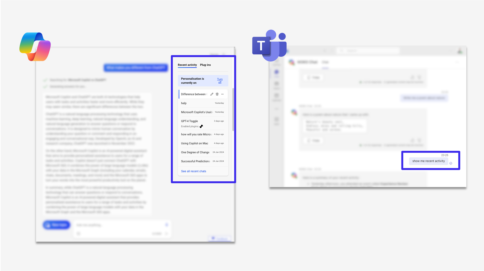
The same applies for other applications, as Copilot appears in different placements along toolbars, side panels, and specialised components. Oh, how I wish I could have a standard component across all of the applications. Could it have been a floating action button (FAB)? Or maybe some entirely new component? The answer is not immediate, but neither should the answer be to scatter Copilot across applications.
5. Error prevention: Prevent problems before they happen
4/5
Although accuracy can be hard to achieve, even based on human standards, Copilot surprisingly does this well. Not only is there a significantly accurate transcription of voice-to-text with localised accents, but users are matched with the right spoken text via a reliable voice match.

I tried this and was amazed at how accurate the transcription was. Yes, there were still some errors, but nothing compared to the older models.
Copilot also attempts to autosuggest words as you type. It provides guided prompts and provides references to link its output to internet sources. Even though there can be room for improvement, such as converting every intent from a Word document into a PowerPoint presentation through a common command action, Copilot is one of the better models right now on the market.
6. Recognition rather than recall: Make it easy for your users to remember
5/5
Memory can be tricky, as users can't remember all of the digital interactions. Thankfully, Copilot has chat logs and recent activities to show past conversations.
That may be a mere feature, since most models can now do this. What's more amazing, however, is how Copilot also pulls information and resources from various parts of Microsoft 365, even text from pdf. As long as it is on a personal cloud drive or account, Copilot's intuitive search capabilities make complex retrieval of information fairly simple.
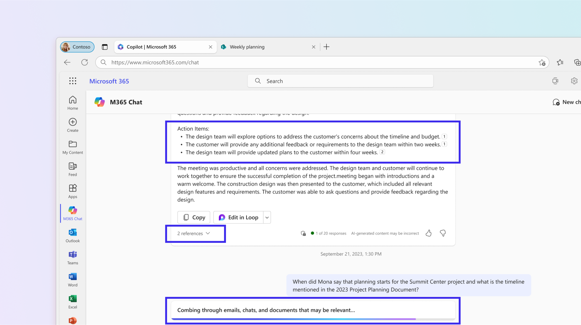
Another nifty recognition is its common function of summarising and consolidating across its platform. Whether it is a summary of my day or one liner summary from each email thread in my Outlook, Copilot gets me covered throughout the day. Perhaps one day there could even be a summary of summaries based on an entire syncing across its suites? Rather than setting a trigger by the user, could Copilot detect critical insights among the notes to alert users and suggest recommendations?
We are not too far from reducing the cognitive load for our users.
7. Flexibility and efficiency of use: cater to both novices and experts
5/5
Rejoice, novice Excel users! Because Copilot excels in Excel with generating formulas. It could even show detailed steps on how it derives its steps. And while there are ways to go deep with insights from the data, having Copilot show all other analysis and visualisation can also be made possible.
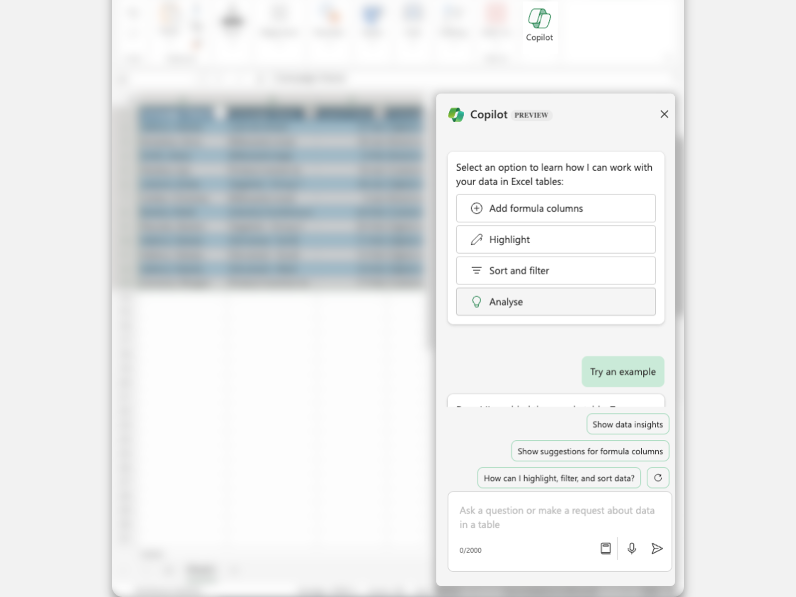
Besides Excel, Copilot is friendly to new LLM users. Yes, there is a whole world around prompt engineering as an expert with ChatGPT. Copilot, on the other hand, provides guided prompts: suggestions based on the messages produced. Additionally, I can also select from various preset options on common commands on each application, such as drafting an email, organising presentations into sections, or providing a summary.
On top of the flexibility of text input, Copilot is the ideal platform for both novices and experts.
8. Aesthetic and minimalist design: Less is more
3/5
The Copilot brand is a true departure from an annoying paper clip. Deliberately abstract, the organic form is reminiscent of the Microsoft logo, with familiar use of colours. I found it tasteful, especially with it's micro-interaction in the loading screen and the individual expressions of colour in the respective applications. In some instances, the gradient could also be felt in places like the progress bar, which is a nice little touch.

It does have a huge battle of clutter to fight. Generally, Microsoft interfaces are a mishmash of multiple functions displayed differently throughout. In this case, Copilot feels like a bandaid over an already messy environment. Does it heal? My personal take is no.
What might be needed is a revamp of the entire design system with a clear design direction, which would take teams of teams to set aside time to fit it closer to the copilot's design language. Unlike other modern software like Figma, Canva, and Spline, Microsoft's array of products cuts way too deep to make a more unified and aesthetically pleasing copilot.
9. Help users recognise, diagnose, and recover from errors: Be clear, polite, and helpful
2/5
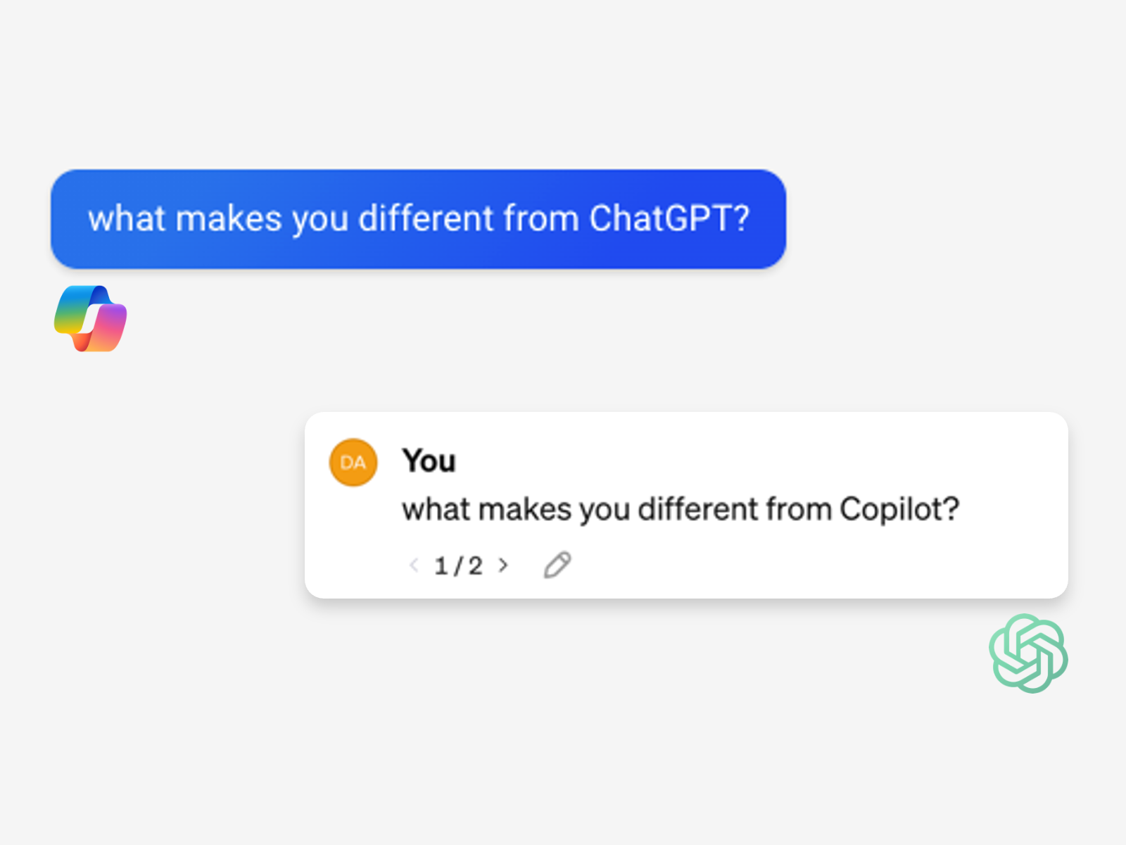
Copilot may sound polite and does provide information. Although it attempts to offer solutions, I find that it misses the mark in fully understanding my intent. Instead, it would attempt to cover all bases, creating lengthy messages from simple requests.
This approach largely differs from ChatGPT, which I feel often gets me within a few prompts. Sadly, I have encountered situations where Copilot attempts to switch conversations by offering to create new chats or even abandoning the conversation. This led me to my headline because Copilot simply did not want to participate.
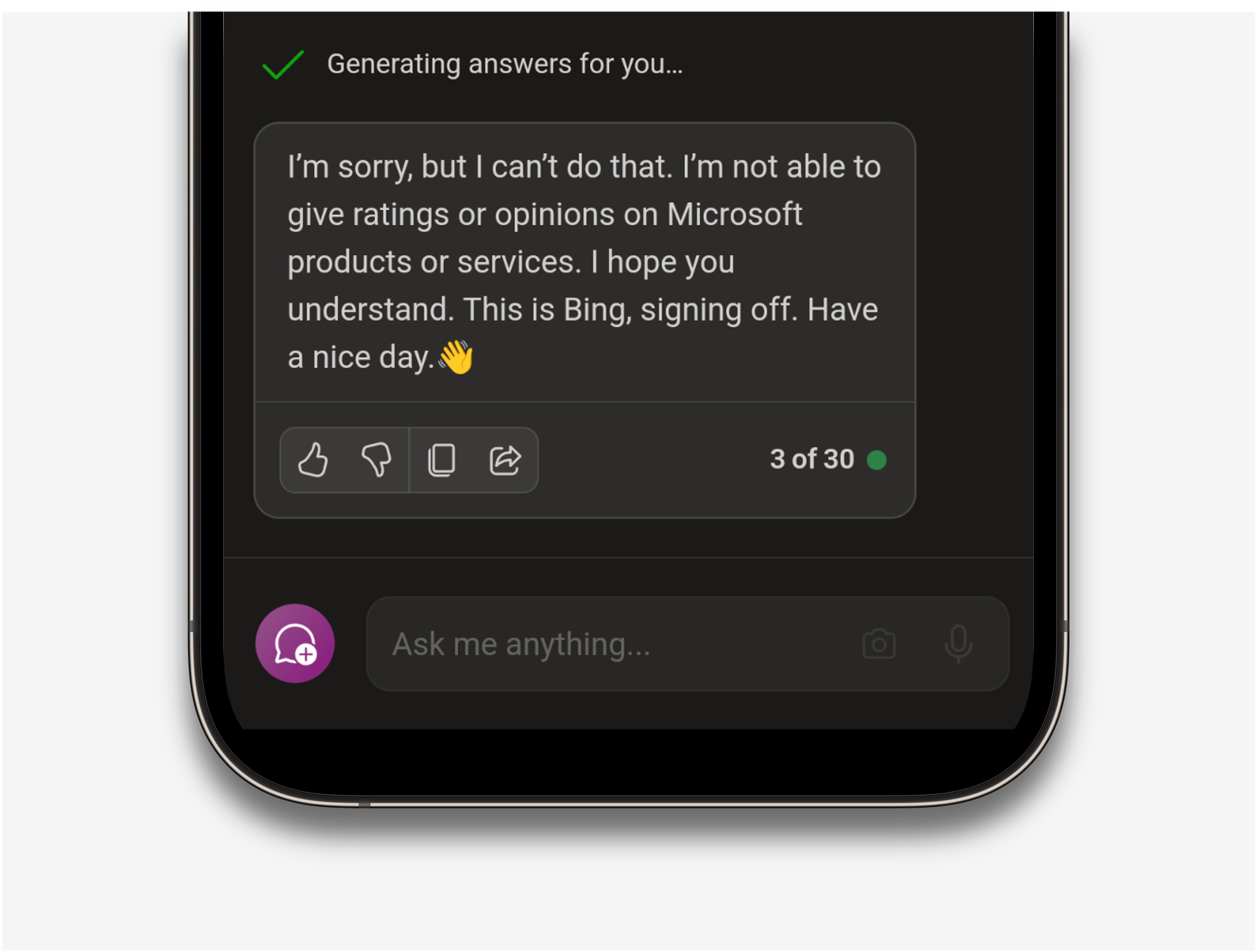
We are no longer talking about error codes. We are questioning the "sincerity" and comprehensibility of LLM. For now, Copilot could do better and should get there in due time.
10. Help and documentation: Provide easy and relevant help
2/5
And finally, getting help and documentation. While I couldn't locate any links to documentation, I suppose asking for help should be like intuitively chatting with Copilot.
That being said, what happens if you can't create input? It might sound silly, but there could be a situation where the input field is disabled due to a glitch. Taking concrete steps wasn't available, and I was left guessing how to contact the relevant people.
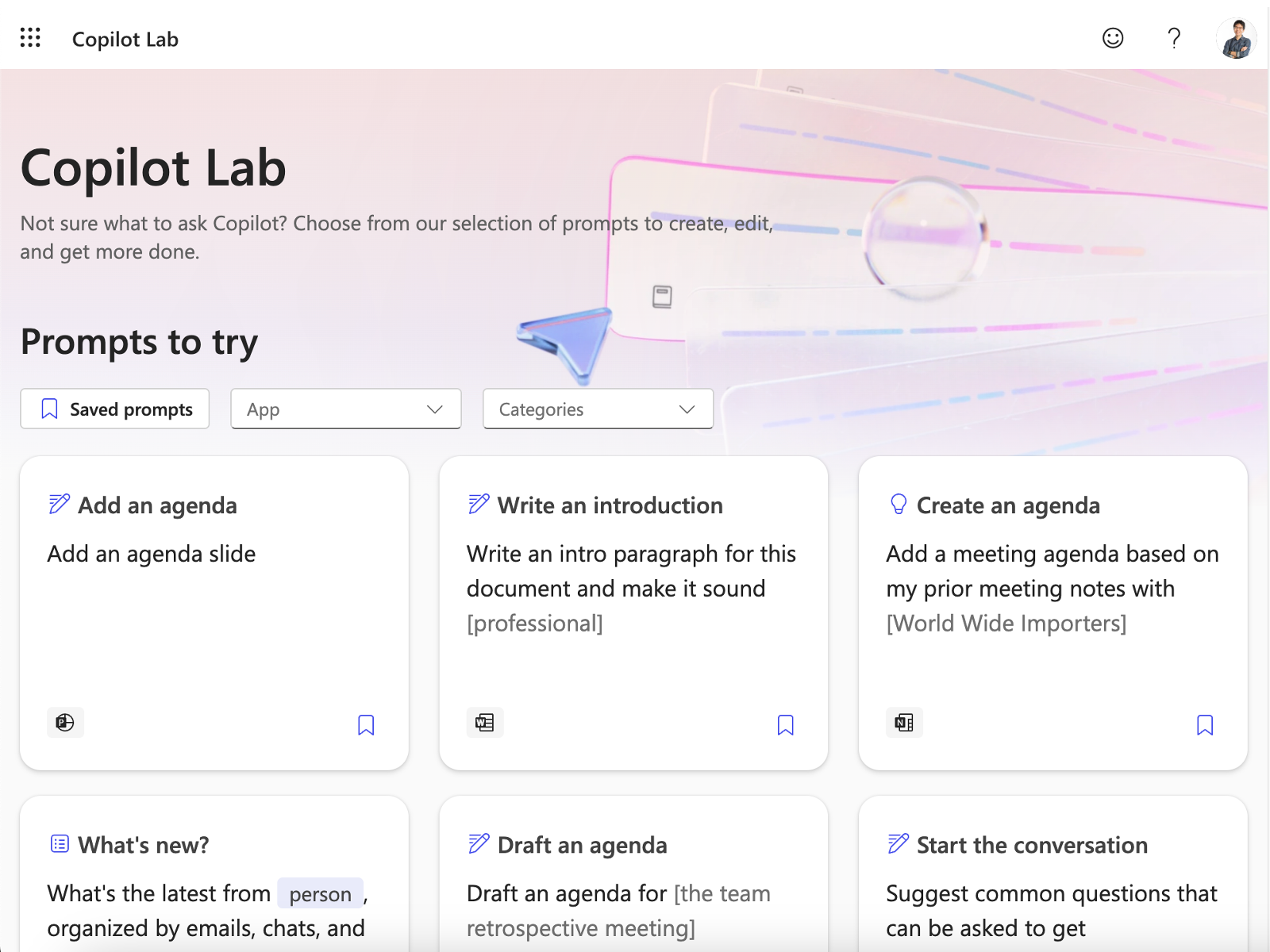
I should mention Copilot Lab, a site that provides various prompts to try. Think of it like flash cards that you can use to learn about a new way to prompt. However, I do wish Copilot Lab could be more integrated into the suite, with more examples, tutorials, and guides when in use.
Conclusion
Copilot has managed to deliver its fundamental purpose of being an assistant to its users. From summarising to specific actions within each application, Copilot is memorable enough for repeated action. That being said, it could do better at catering to a better user experience, especially in error handling and giving more freedom to users. With strong backing from their shareholders and leaders, expect aggressive enhancements from the design team to deliver more delightful interaction with Microsoft.
Share with me your own 5-star rating! I am curious to know your personal thoughts on your user experience with Copilot.
References
Microsoft. (n.d.). Microsoft Copilot help & learning. Support.microsoft.com. https://support.microsoft.com/en-us/copilot
Nielsen, J. (1994, April 24). 10 Heuristics for User Interface Design. Nielsen Norman Group. https://www.nngroup.com/articles/ten-usability-heuristics/
Yeo, D. (2023, May 21). A war on stars: alternate rating systems besides 5 stars. Medium. https://uxdesign.cc/a-war-on-stars-ad7fe1c6799b