Journeying with a different kind of map in 2024
Harry Beck revolutionised maps in 1931; now, in 2024, let’s challenge the status quo of journey maps.
Part 1: Beck Revolutionises the Tube Map in 1931
The year is 1931 in London. An unassuming engineering draughtsman by the name of Harry Beck started his career drawing schematics for the electrical system of the underground train network. What he didn’t know was how his journey of drafting would lead him to create one of design’s most important pieces: London’s Underground subway system, also known as the Tube map.
It was not like any other map. Unlike his predecessors, his map took a radical twist out of the norms. He would remove geographical accuracy by stripping distance measurements and prioritising the subway systems over other information. Next, he instilled geometrical beauty by creating straight lines while incorporating a recognisable feature, such as the Thames River, to signify landmarks in their context.
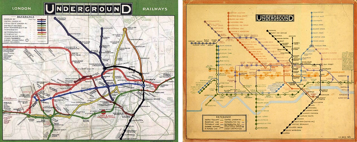
As expected, anything new would meet skeptics, and Beck was no exception. After all, how could a technical draughtsman be an innovative cartographer? The initial design would meet rejection on a couple of occasions before his perseverance paid off when he was allowed 500 copies to be distributed at a few stations in 1932. The rest was history a year later, when seven hundred thousand copies were printed and reprinted only after a month of publication.
Einstellung Effect and the Challenge in Design Thinking
What made Beck’s map so successful? Perhaps he knew that topological information would not appeal to train passengers, since most of them were commuting underground. Or perhaps he incidentally stumbled into the right time of the modernist design movement, suiting the taste of consumers who were looking for simplicity in information design. Whatever the combinations were, with a little courage and freedom (he was unemployed while creating the map), he gave rise to a new visual language of urban navigation, influencing designers Massimo Vignelli and many other system designers.
The impulse to look at information differently does not come intuitively to experts. Known as the Einstellung Effect, this mental phenomenon relates to an individual’s prior experience and knowledge, preventing them from accepting optimal solutions to a problem. The greater the experience, the stronger the cognitive bias becomes.
As practitioners of a craft, we have the tendency to dismiss alternatives rather quickly, largely due to our intuition and expertise. The problem comes when our formal thinking requires an update, especially when any of the following conditions are met in our environment: volatility, uncertainty, complexity, and ambiguity (VUCA). Mix it up with the pace of technological advancement, and you will have a false judgment from the experts. Ask the fathers of behavioural economics, Daniel Kahneman and Amos Tversky. Their short answer can be found in their magnum opus, Thinking Fast and Slow.
So when we turned our gaze to another map, known as the journey map, we could be met with similar reactions from seasoned practitioners.
“It ain’t broken; why fix it?”
Neglected Potential of Journey Maps in Design
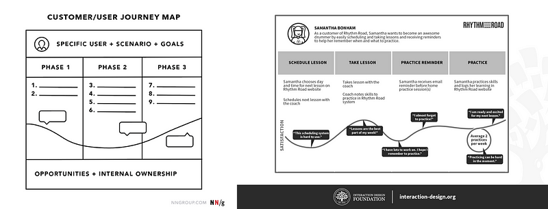
The journey map is a regular staple in any designer’s manual. Standards in places such as NNG and IxDF are already written about what they are and how to use them. They appear in design bootcamps, design curricula, and workshops; thus, one will assume that the topic is well covered.
Unfortunately, that hasn’t been the case based on the following reasons:
a. Journey maps are boring to visual designers
Felix Lee, design CEO of ADPlist, says it best:
“Too many designers are just focusing on UI (how it looks), some on UX (how it works), but very few focus on why (why it is essential for the users and business).”
My hypothesis is that designers are still more concerned about how their screens look and the associated flows, but less interested in the fundamental problems and goals faced by their users. There is a disconnect because journey maps aren’t as visually appealing to them, unlike a set of screens interconnected with one another.
The missed opportunity is how the two artefacts can potentially be integrated rather than seen in isolation.
b. Perceived usefulness vs. actual redundancy
Despite design education preaching about the benefits of the journey map, most maps feel like a PowerPoint slide or a one-off piece of work used in a stakeholder meeting.
This is where design thinking is responsible for its placement, typically only in the middle of the process, somewhere after customer interviewing. As a result, journey maps are forgotten during the development and delivery phases.
Again, another missed opportunity to involve the entire value stream of collaborators and the reusability of the map.
c. Wildly different formats
Designers would have come across the names of the following maps: customer journey map, user journey, user flow, screen flow, service blueprint, mental model diagram, process workflow, user story mapping, and the list goes on.
The problem gets trickier when larger teams with multiple designers create different variations of the different maps. Over time, the problem compounds when different projects, products, or iterations turn these maps into a big pile of mess.
The missed opportunity here is the failure to make sense of the various maps as well as to create a consistent standard way of designing a set of maps.
d. The Einstellung Effect applies in this situation too
We fall back on our post-its and emotion charts without thinking deeply about the alternatives. Although we as designers have a huge mandate to design products for our clients and company, sometimes leaving some time to redesign our tools is equally important.
Part 2: The “Beck” Effect based on a Personal Account
The year is 2007, this time in a remote part of Singapore. As a national serviceman of the survey engineer unit, I was tasked with drawing various maps in the army battalion that I was serving. From route maps to site egress, I needed to create a system of legends that was familiar not only to other survey engineers but also to the vehicle commanders responsible for various military vehicles.
However, my map happened not to be like any other map. Unlike my predecessors, which were mainly hand-drawn sketches, my map took a technological twist, partly due to the army’s push towards using computers in the field. It was there that I started creating a digital library of reusable assets, such as vegetation and fences, that could be replicated across any map template.
Soon, others will join me to produce more maps quickly. We will work on our large workstations using the only digital tools, such as Photoshop and Illustrator, allowed in the army camps to create an entire deck of maps useful for the batallion.
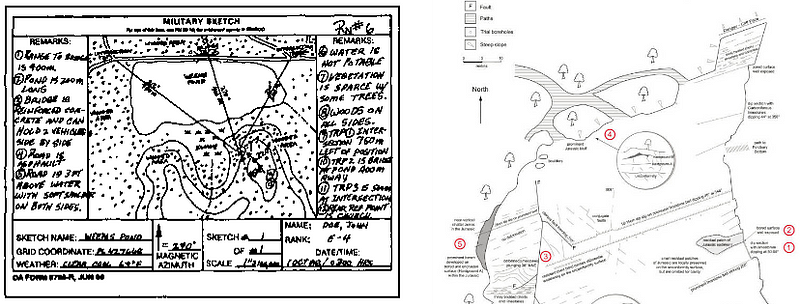
Ever since I finished my national service, I imagine this practice will continue with subsequent cartographers. I, on the other hand, had experienced the “Beck” effect in the early days—the mental phenomenon where new designs are created based on the restraints of judgement. Instead, we gave ourselves time and grit to incubate the idea of moving away from hand-drawn sketches that will lead to an entirely new creation of maps for an organisation.
What will Beck do if he has a journey map in front of him in the 21st century? A world that is highly connected, with cloud services in your hands. A world that makes use of artificial intelligence to be more efficient. A world filled with the same journey maps as to how it was used with physical post-its more than 20 years ago, as experienced by David Kelley when he first started the d.school?
Let’s try this one more time.
Part 3: Redefining Journey Maps with a Vision for 2024
The year is 2024, this time in the digital realm of the universe. As a design facilitator, we seek the wisdom of other design innovators by initiating a different way of looking at journey maps. Here are some guiding principles before inspecting the map(s).
Guiding Principles for Innovative Journey Maps in 2024
a) Streamlining Information: The Beck Style
Like Beck’s approach, we strip the map of all secondary information. Instead, we should create an organising principle so that simplicity can blend with complexity. Show only what is needed, while hiding the rest until required. The end result could be a search or filter mechanism.
b) Gardeners, Not Owners: Advocating Cross-Participation
We advocate cross-participation. Designers do not own journey maps. Instead, they are more like gardeners, tending to a garden. The patrons of the garden are the entire team of developers, product managers, other designers, stakeholders, and customers. They create desire paths by giving perspective to the choices they make. And because we respond by connecting and linking the discussions, the garden/map gets reused over time, turning from a courtyard into a national park.

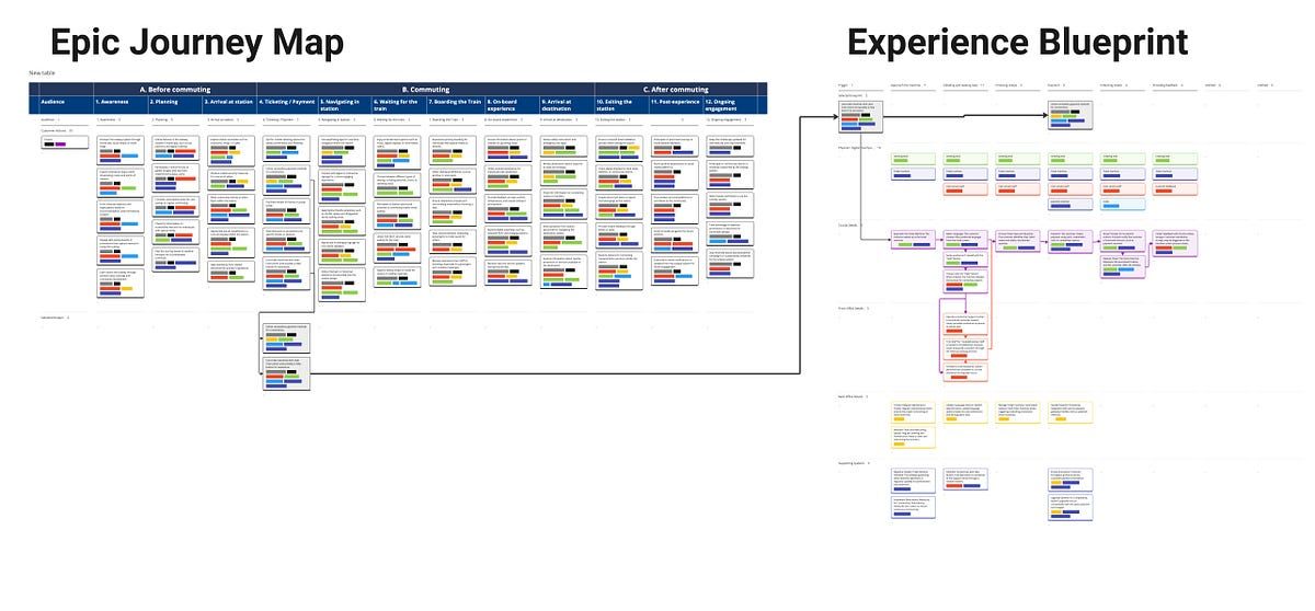
c) Maps in Harmony: Linking Multiple Maps with Meaning
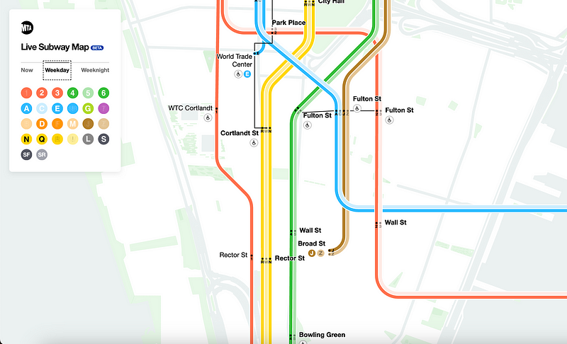
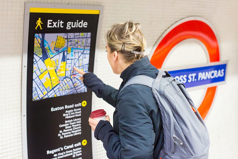
Why use one map when multiple maps can be used all at once? The key point is to link the maps in terms of meaning. Let’s use the subway as an example. Besides the tube map, which shows all stations at a glance, each station has its own entrance/exit guides showing nearby amenities. The army uses a specific site survey as a reference but also has larger route maps for moving from point A to point B. Likewise, what if design maps have a relationship with each other? We propose that the user’s journey map can be adjacently used with a service blueprint. Because while the user journey map shows the bigger picture, the service blueprint focuses on the granular details of interaction between users.
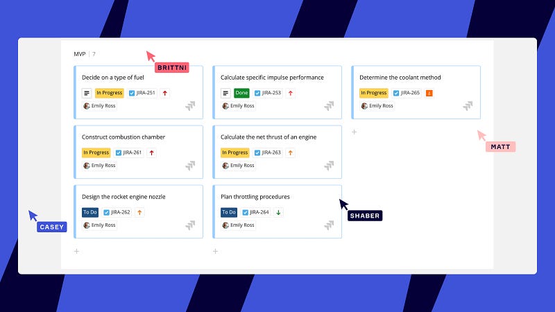
d) Power of Cards: Modular, Reusable, and Integrable
Lastly, at the centre of it all is the use of cards, a modular, reusable, and integrable component shared by different systems and people. JIRA users may be familiar with them, but so do Miro, Figjam users, and many other platforms. Unlike their predecessors, the post-its, the card, and their respective canvass can embed more information. They can also link to other cards, gardens, and universes. Suddenly, we gave a new level of interactivity and meaning to maps. And they won’t be discarded as a PowerPoint slide.
Closing Thoughts
As expected, anything new would meet scepticism, and this suggestion is no exception. But with enough grit, time for incubation, and wisdom shared by other design innovators, perhaps perseverance could pay off in the next few years.
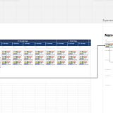
I leave you with a gift: access to the template with generic content (thanks, AI). For the past 2 years, my team has experimented and rolled out various outputs based on numerous iterations of a similar template. The latest feels promising.
As we close the chapter in 2023, let’s stay hungry, focused, and excited about the new year ahead.
References
Dam, R., & Siang, T. (2019, June 14). Design Thinking: Get a Quick Overview of the History. The Interaction Design Foundation; UX courses. https://www.interaction-design.org/literature/article/design-thinking-get-a-quick-overview-of-the-history
FamousGraphicDesigners.org. (2018). Harry Beck | Biography, Designs and Facts. Famous Graphic Designers. https://www.famousgraphicdesigners.org/harry-beck
Gibbons, S. (2018, December 9). Journey Mapping 101. Nielsen Norman Group. https://www.nngroup.com/articles/journey-mapping-101/
Interaction Design Foundation. (2019). What are Customer Journey Maps? The Interaction Design Foundation; UX courses. https://www.interaction-design.org/literature/topics/customer-journey-map
Kahneman, D. (2011). Thinking, Fast and Slow. Farrar, Straus and Giroux.
Lee, F. (2023, December 26). This is the 1 skill designers will need. ADPList’s Newsletter. https://adplist.substack.com/p/this-is-the-1-skill-designers-will