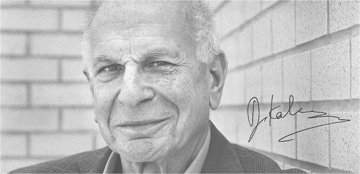
Remembering Daniel Kahneman in our UX practice
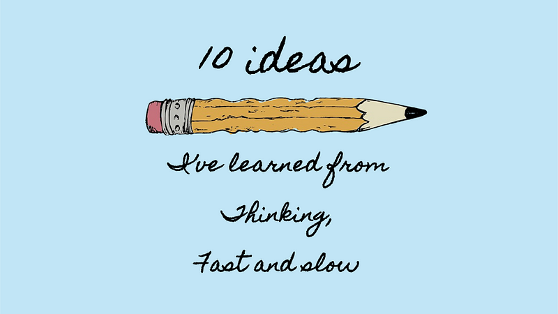
10 ideas I’ve learned from Thinking Fast and Slow
Renowned Nobel Laureate in behavioural economics Daniel Kahneman has recently passed away at 90 on March 27, 2024. His book, Thinking Fast and Slow, has helped shape conversations about human judgement and decision-making across industries, including business, psychology, and UX design.
My encounters with Kahneman’s materials came from his generosity when he shared his ideas in various settings, from TED talks to podcasts. In one particular podcast, host Shankar Vedantam had the opportunities to unpack many of his ideas on stage with Kahneman.
Over time, his work has given me new meaning to my own work in design. And so, as a tribute to him, the following sections reveal some of his brilliant concepts from the interviews by Shankar, as well as additional notes in italics about my personal takeaway as a UX practitioner.
Let’s dive in.
1. On experiments and questions
Psychologist Walter Mischel inspired Daniel Kahneman with his work on the marshmallow test with young children. It was his approach to testing his theories with experiments and sharp questions that attracted Kahneman to follow along. Kahneman also observed that there weren’t many choices for selecting similar problems, and he narrowed down to two: in vision or perceptual effects; and in judgement. Kahneman and Tversky chose the latter, which made them the architects of behavioural economics.
UX is the visual experimentation of questions. As we design our experiences, we should be constantly crafting hypotheses that test our assumptions and lead to favourable outcomes. They may range from the interactions of components to the mental model of a flow to the perception of a product. Attempt using think-aloud testing with 2–3 users, or tools like Maze to get reactions from a slightly larger sample size (20–30 users) before going big with releases. If you are already practicing this, you are emulating the same practices as Kahneman and Tversky, and would be scoring big.
Let UX come as experiments with a set of questions to be answered.
2. The science of luck is based on collaboration and intellectual humility
They say two heads are better than one, and the case of Daniel Kahneman and Amos Tversky is clearly evident. Although their partnership did come with stresses over conflicting ideas, it also came with playful thought experiments, laughter, and learning from mistakes. Intellectual humility helped the two researchers not to hold back on stupid ideas. It helped to build mutual trust and confidence, which created more opportunities for reliable intuition and luck.
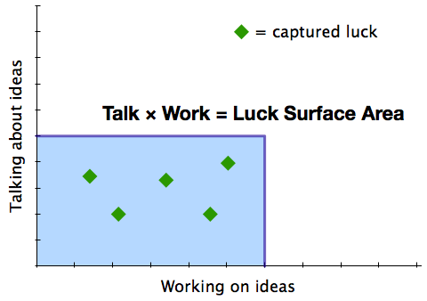
The “Surface Area of Luck” is equivalent to the action you take towards your passion, multiplied by the number of people you effectively communicate your passion and activities to. In other words, it refers to your chances of being lucky. Or, in mathematical terms,
Luck = (Passionate) Doing x (Effective) Telling
Given that these two researchers had one another, they fed their passions in the same company with a healthy dose of candour to sharpen each other’s thinking.
In the same manner, finding a fellow design companion within a development squad may be beneficial to bounce ideas, ask questions, and check on work occasionally. If pair programming is a known agile technique where two developers work together on the same task, perhaps pair designing could take on the same approach too. Chances are, your luck and work rate will increase exponentially.
When given a chance, two designers are always better than one. More work done, twice lucky.
3. On prospect theory:
“The stories about the past are so good that they create the illusion that life is understandable, and that’s an illusion, and that they create the illusion that you can predict the future, and that’s an illusion.”
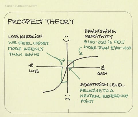
Perhaps one of the most profound discoveries that led Kahneman and Tversky to their Nobel Prize is the Prospect Theory, which is a phenomenon of how we value losses and gains disproportionately. Also known as loss aversion, our subjective feelings around value often gets in the way of objectivity. Due to our biases and heuristics, we often prefer to avoid a potential loss rather than risk a potential gain. We also tend to choose options with more certain outcomes due to our inclination towards risk-aversion.
On that note, designers practicing user-centricity should endeavour to put the user’s needs first. Consider how content and visuals may influence people to act irrationally, and put ethical guardrails in place so that all information is presented in a way that encourages objective decision-making.
In the same manner, we too, as designers, ought to reduce our risk aversion and cognitive biases when developing new work, especially when the user is at stake and no one else in the industry is doing anything about it. Rather, we should recognise the actual risk involved before making the decision. Ask ourselves both questions:
- What will happen if we go ahead with the design? What will we gain? What will we lose?
- What will happen if we drop the design? What will we lose? What will we gain?
These questions may sound repetitive, but by attempting to answer them in four quadrants, designers can identify any fallacies in their initial thinking.
Being user-first is our guide towards eliminating loss-aversion.
4. On the fast and slow mind
There is an inevitability that the human mind can capture all information at once. That’s what makes us (almost) completely irrational, especially when we have to make 35,000 decisions in a single day.
Daniel Kahneman and Amos Tversky characterise the mind into two parts: System 1, which is often associated with fast thinking, and System 2, which is for slow thinking. Thus, it is the 35,000 decisions that often result in us being slaves to System 1.
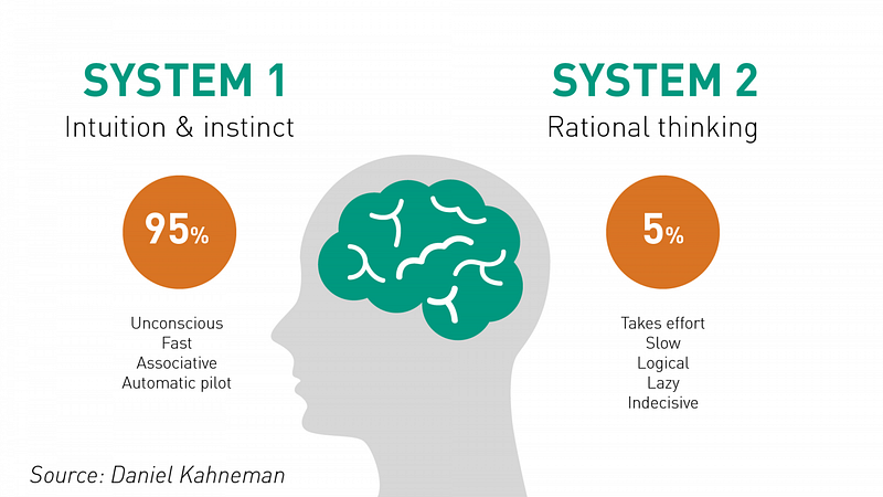
Rather than neglect, the strategy is to encourage dual thinking at the right junctures. According to Albert Shum, there is plenty of UX design around System 1 tasks—hitting the like button, sending an instant message, and keeping scrolling for more content. Our response is almost automatic, such that our engagement time is down to the millisecond. The quicker, the better.
At the same time, System 2 tasks requires time and energy for processing information. Having loading screens allows time for users to dwell on their task, while bookmarks and persistent states encourages users to revisit their current transaction. These strategies help users lower their energy debt and give back more time.
Give equal weight to both system 1 and system 2 UX.
5. On sensemaking with complexity
Because we have the tendency to seek coherence and understanding in a seemingly chaotic world, our inherent ignorance leads to tough consequences. System 1 may serve us well in navigating daily life, but it also leads to errors, particularly in abstract, distant, and debatable concepts like climate change. Unlike immediate and tangible threats, our cognitive limitations pose significant obstacles to addressing complex, long-term issues, which explains why the majority of people fail to take further action with climate change.
Again, we need to give ample opportunity for system 2 to strike a balance with system 1. Our forte as UX designers is helping users overcome abstract concepts with simplicity through visual graphics or with words as metaphors or other creative expressions. Only by quietening the anxieties of system 1 thinking, can we make the voice of system 2 thinking louder (see the metaphor at play here?)
Observe how the following video helps us understand the complex topic of food and climate change better:
By using a brick to represent carbon emissions, we are able to make sense of the magnitude of the food mile, and where to draw our attention instead. The visuals relieve our system 2 from overloading, but at the same time, they depend on system 1 to catch a hint of attractive information. As designers, we have the agency and creativity to meld the two systems to operate harmoniously together.
Create empathetic visuals to relieve the mind from complexity
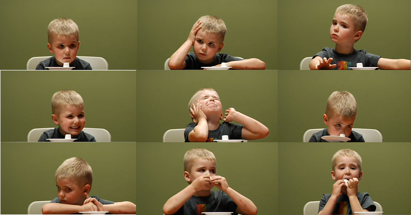
6. On Peak End Rule and 2 versions of our selves
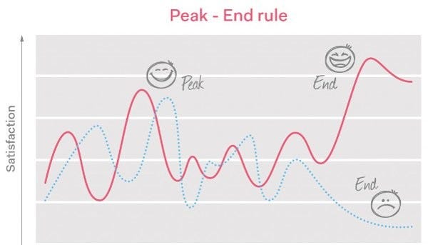
In the famous colonoscopy research study, Daniel Kahneman and Amos Tversky observed that people form memories based on the “peak-end rule“ moments rather than the duration of an experience, particularly in painful situations. Thus, two versions of ourselves coexist, respectively: the remembering selves and the experiencing selves.
People who cherish the experiencing-self view happiness as being more social and spending time in the present with the people they love. Ultimately, decision-making happens with the remembering-self of memories and perception, distorting the accurate measurement of satisfaction or pain.
According to Dr Claudia, psychologists estimate that a moment may last up to three seconds. To put it into perspective, that means we experience roughly 20,000 moments in a waking day, with at least 500 million moments by the time we reach our 70th birthday.
The journey map, or experience blueprint, is an excellent tool to analyse and design moments in a person’s journey. Knowing the current realities felt by a user is an important clue to weighing whether there is a need to enhance the general experience.
Imagine sitting on a ship with no entertainment. Surely, that boredom will kill anyone. Likewise, paying attention to the end of the experience by creating a positive surge of satisfaction helps users recall an incident better.
Plot the actual steps taken by the users to make better decisions on creating key moments.
7. On misery
In another study, Kahneman measured how much people felt in different states, positive or negative, within a day. The findings revealed that, on average, 80% of people felt positive 80% of the time. What was interesting was that more focus can be placed on the 10–15% of the population that is experiencing misery. Almost like they are on two different scales, Kahneman argues that reducing misery should be a tangible goal that aims to address underlying issues. After all, measuring misery, or pain, is much easier than measuring happiness.
Painpoints are well-known indicators to designers, who are on a constant lookout to resolve issues in usability testing. However, misery takes the concept a whole different level because it gives a sense of sustained pain over an extended period of time. And by recognising people on the fringes who are going through such conditions, we are not normalising any experience but catering special actions for users who just need less suffering in their current situation.
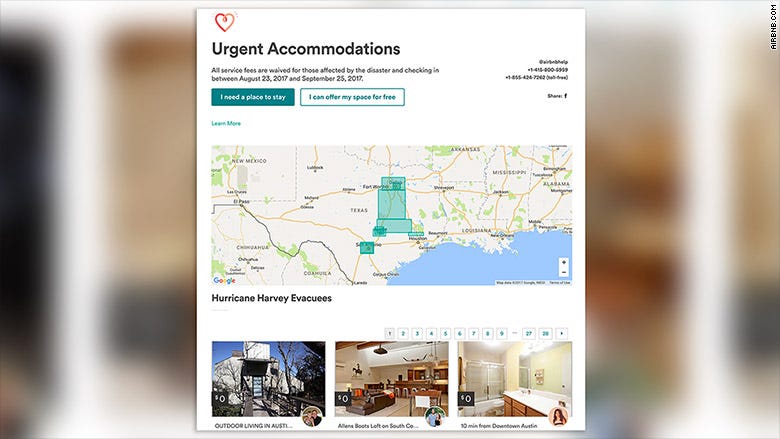
Airbnb is an example to follow with their versatile platform. Not only have they made a business in the sharing economy of the housing market, they have used the same platform to do good. When Shell, a Host in Brooklyn, New York, offered her place for free to Hurricane Sandy evacuees in 2012, Airbnb asked for support from others in the community, and over 1,000 local Hosts opened their homes to people affected by the storm. Since then, Airbnb has developed a programme that enables hosts around the world to offer their places during times of crisis and emergency.
Besides making the majority happy, let’s also use UX to reduce misery for all.
8. On delaying intuition
“Intuition is nothing more and nothing less than recognition,” says Kahneman. The speed with which experts recall knowledge is what makes them valuable, but according to Kahneman, when problems are unique, intuition may lead experts into error because of the lack of boundaries in their domain expertise. Kahneman calls for a delay in intuition, or judgement, when it comes to decision-making. Resorting to checklists, independent evaluations, and conducting pre-mortems is what Kahneman feels will help in gathering information to make better decisions.
In the previous post, I mentioned the Einstellung effect, which blocks us from looking at new perspectives due to our expertise. In addition, Kahneman has offered a systematic structure to delay spontaneous reactions.
One important area worth mentioning but often underrated is the practice of software quality assurance (QA). Not constrained to developers, QA can also apply to UX/UI by running visual tests or cross device or browser simulations to see if there are any defects. Although designers have an urge to launch and are tempted to go with the intuition that their screens will come off exactly the same, delayed gratification prevents end users from experiencing an unexpected or catastrophic error once it goes into production.
Delay intuition. Run your checks to assure quality of UX.
9. On Noise
Simply put, noise is unwanted variability in judgements or decisions, which leads to inconsistent outcomes. The trouble with variability goes right down to various human conditions, ranging from the time of day to the weather to even past personal events.
To increase reliability, Kahneman advocates for statistical thinking, rather than stories and anecdotes, which is what the mind prefers. While algorithms and machine learning may help reduce typical errors, Kahneman also recommends the averaging of independent assessment, whether it is through the wisdom of the crowd or by self-averaging by the same person at different times.
Perhaps one of the most controversial topics about usability testing is the sample size of users, with many citing the fallacy of Nielsen’s famous 5 users. Kahneman’s case on variability may point exactly to this issue, except there are 2 (or more) factors to consider.
Firstly, Nielsen’s 5-user recommendation is for qualitative tests. Even for quantitative test, testing with 20 users typically offers a reasonably tight 90% confidence interval.
Secondly, averaging can still be applied because the sample size is larger than n = 1. However, based on the tests run by NNg, having more users based on their recommendations wouldn’t significantly improve the results.
Of course, many companies will still go for larger sample sizes, but it would then be a matter of managing the cost or return on investment (ROI). Both Kahneman’s and Nielsen’s continue to be valid, provided that single users evaluate the tests independently.
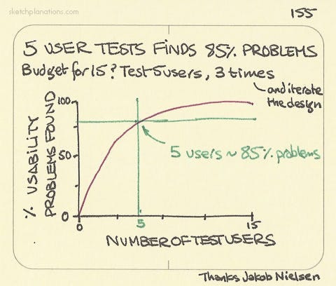
Reduce noise by having a “good enough” number of users for every usability test.
10. On positive variability
Not all variability is bad. Creative enterprises thrive in such settings when they are trying to innovate or come up with new ideas. However, a selection mechanism needs to be in place so that better decision-making can take effect. Otherwise, it will revert back to undesirable variability, or noise.
Classic double diamond. Divergent thinking involves creating options, and convergent thinking involves a selection mechanism like using DVF scoring to pick out the top ideas.
Create choices. Select the best option.
Bonus: On owning judgement
“The main thing to do if you’re attempting to improve the judgement of people in an organisation is to convince those people that they want their judgements to be better.”
Kahneman emphasises the importance of addressing noise in organisations without imposing rigid rules that undermine people’s autonomy and judgement. Instead of forcing rules and mechanising the procedures, it’s more effective to involve people in developing their own solutions. By allowing individuals to feel ownership over the process and decisions, they are more likely to embrace the changes and work towards improving their judgements, which in turn aligns with the organisational goals of uniformity.
In the same way, we cannot impose UX on organisations. However, if we can convince that our lives (and business) will thrive with better user experience, then giving room for teams to develop their appetite for UX can be encouraged, so that the practices can assimilate into their existing processes. Some teams may be user-driven and will embrace systems thinking and continuous design integration and delivery. Others may need a behavioural nudge to adopt simple usability testing in their sprints. And some teams will continue to be laggards, void of user and interpersonal experiences.
Imposing UX isn’t user-centric at all. Cultivating UX is.
Daniel Kahneman is a brilliant thinker and has offered a wealth of knowledge. I leave you with a final quote.
“No one enjoys being wrong, but I do enjoy having been wrong, because it means I am now less wrong than I was before.”
Thank you, Danny, for inspiring me with your work.
How has his work done the same for you?
References
Aguirre, C. (n.d.). Remembering vs. experiencing — Headspace. Www.headspace.com. https://www.headspace.com/articles/remembering-vs-experiencing
Kahneman, D. (2011). Thinking, Fast and Slow. Farrar, Straus and Giroux.
Kahneman, D. (2018, March 12). Think Fast with Daniel Kahneman (S. Vedantam, Interviewer) [Interview]. https://hiddenbrain.org/podcast/the-transformative-ideas-of-daniel-kahneman/
Kahneman, D. (2021a, March 16). Daniel Kahneman Doesn’t Trust Your Intuition (Transcript) (A. Grant, Interviewer) [Interview]. In www.ted.com. https://www.ted.com/podcasts/daniel-kahneman-doesnt-trust-your-intuition-transcript
Kahneman, D. (2021b, May). Our Noisy Minds | Hidden Brain Media (S. Vedantam, Interviewer) [Interview]. https://hiddenbrain.org/podcast/our-noisy-minds/
Kahneman, D., Olivier Sibony, & Sunstein, C. R. (2021). Noise : a flaw in human judgment. Little, Brown Spark.
McKinsey Quarterly. (2010, March 1). Strategic decisions: When can you trust your gut? | McKinsey. Www.mckinsey.com. https://www.mckinsey.com/capabilities/strategy-and-corporate-finance/our-insights/strategic-decisions-when-can-you-trust-your-gut
Nielsen, J. (2000, March 18). Why You Only Need to Test with 5 Users. Nielsen Norman Group. https://www.nngroup.com/articles/why-you-only-need-to-test-with-5-users/
Nielsen, J. (2006, June 25). Quantitative Studies: How Many Users to Test? Nielsen Norman Group. https://www.nngroup.com/articles/quantitative-studies-how-many-users/
Shum, A. (2024, March 26). Designing Slow Thinking. Linkedin.com. https://www.linkedin.com/pulse/designing-slow-thinking-albert-shum-uwy4c/